How to Create a Grid Layout Using CSS
When designing a webpage, it is good to leave some space between elements so that they are not too close to each other.
When using the grid layout, you can easily add equal spacing between the grid items instead of micromanaging their individual margin. For example:
css
.container {
  display: grid;
  grid-template-columns: auto auto auto;

  row-gap: 10px;
  column-gap: 20px;
}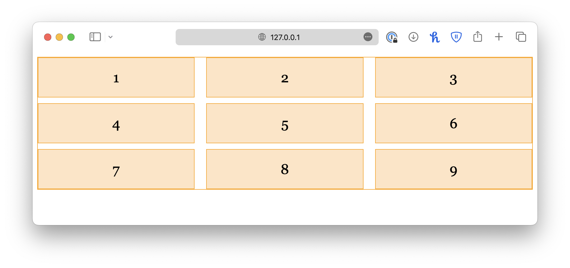
As the name suggests, row-gap adds spacing between rows, and column-gap adds spacing between columns.
Alternatively, you may use the shorthand property, gap:
css
.container {
  display: grid;
  grid-template-columns: auto auto auto;
  gap: 10px 20px; /* row-gap column-gap */
}
If you want equal spacing for columns and rows, give a single value:
css
.container {
  display: grid;
  grid-template-columns: auto auto auto;
  gap: 10px;
}
<!DOCTYPE html>
<html lang="en">

<head>
  <meta charset="UTF-8">
  <meta name="viewport" content="width=device-width, initial-scale=1.0">
  <title>Document</title>

  <link rel="stylesheet" href="/styles.css">
</head>

<body>
  <div class="container">
    <div class="item">1</div>
    <div class="item">2</div>
    <div class="item">3</div>
    <div class="item">4</div>
    <div class="item">5</div>
    <div class="item">6</div>
  </div>
</body>

</html>