Customizing Fonts Using CSS
This lesson discusses how to customize the texts using CSS. These properties in CSS can be divided into two groups:
First, the font properties control the appearance of the font, such as its size, weight, and more.
And second, the text properties control how text is displayed, such as text decoration (underline, strike-through, etc.), case (uppercase, lowercase, etc.), and so on.
We'll start with the font properties.
Changing font size
Most fonts come in various styles, weights, and sizes.

The font properties let you specify which variant you want to use.
For instance, you can change the font size using the font-size property:
p {
  font-size: 16px;
}
When defining font size, the unit px (pixels) is commonly used. But there are some relative units available that offer more flexibility and scalability.
Relative fonts
The most common ones are em and rem. These units are relative to the font size of other elements, making them ideal for creating responsive designs that adapt to different screen sizes.
For instance, em is relative to the font size of the parent element:
<body>
  <p class="p1">
    Lorem ipsum dolor sit amet consectetur, adipisicing elit. Fugiat,
    reprehenderit?
  </p>
  <div>
    <p class="p2">
      Lorem ipsum dolor, sit amet consectetur adipisicing elit. Illum, libero.
    </p>
  </div>
</body>div {
font-size: 10px;
}
p {
font-size: 2em;
}In this example, we have two <p> elements, p1 and p2, and their font sizes are defined to be twice the size of their parents (2em).
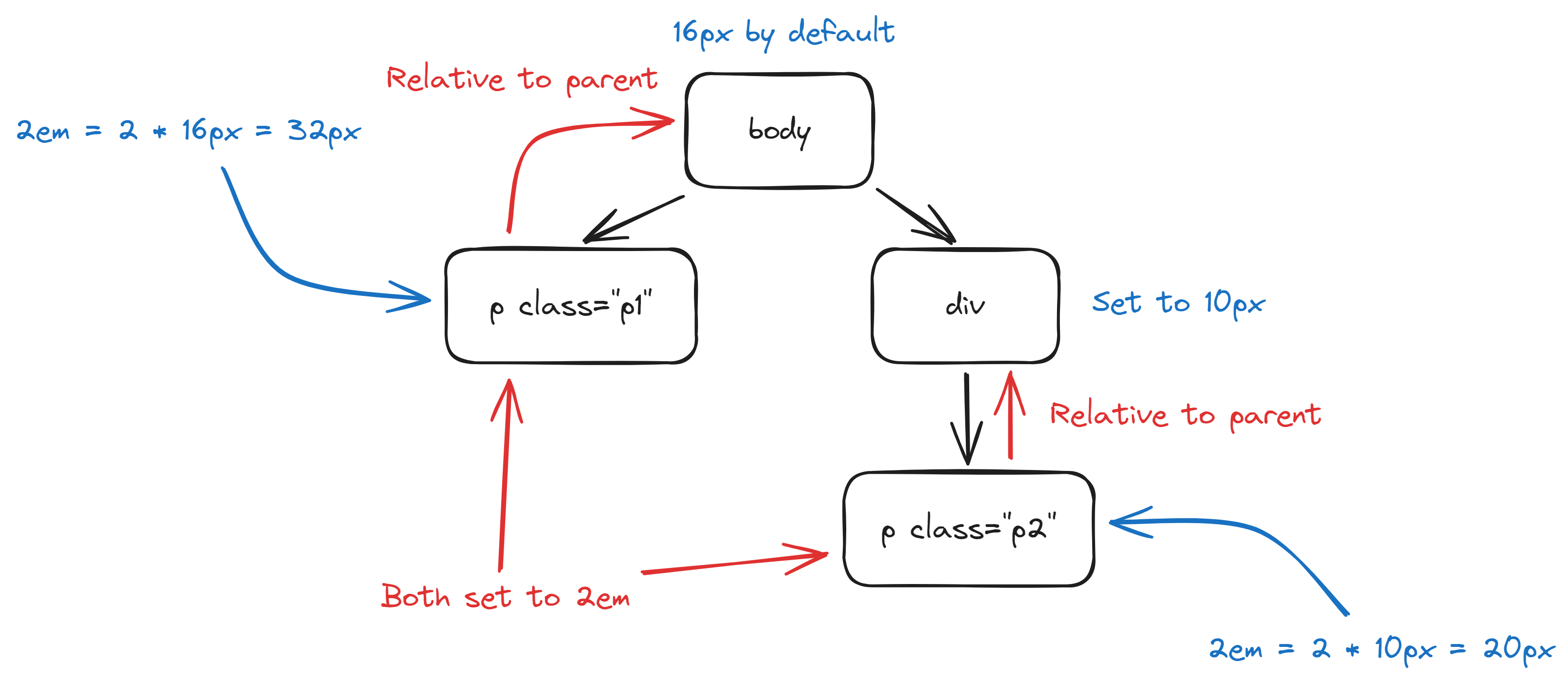
The parent of p1 is <body>, whose font size is not defined in this case. When not defined, the font size defaults to 16px, so p1 will be 32px.
The parent of p2 is <div>, whose font size is set to 10px, which makes p2 to be 20px.
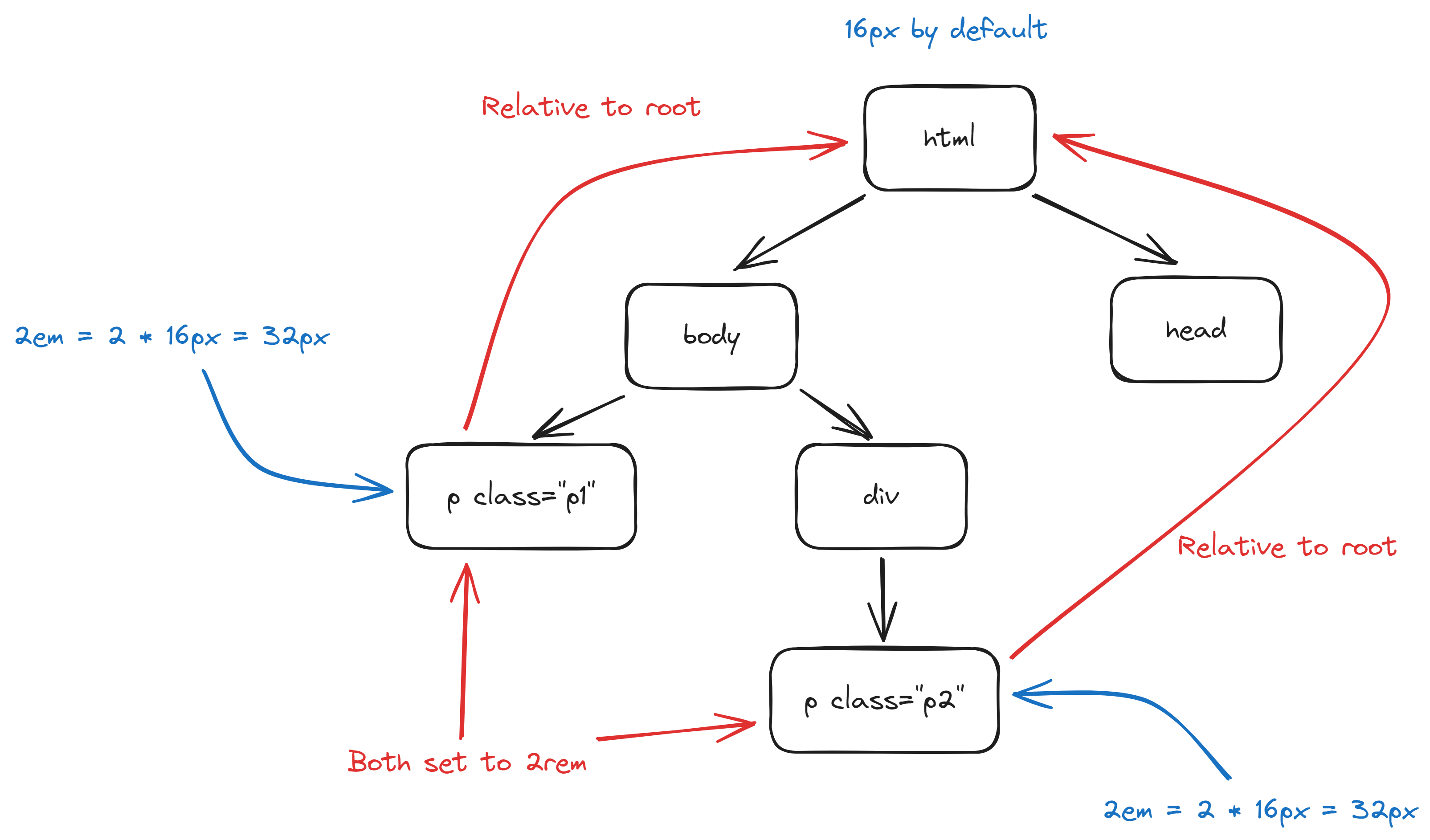
rem, on the other hand, is relative to the root element. This will give you a consistent reference throughout the HTML document, making it the most popular unit for defining font size.
div {
  font-size: 10px;
}

p {
  font-size: 2rem;
}
Font weight
You can also define the font weight, which is the thickness of the strokes, using the font-weight property.
The accepted values include lighter, normal, bold, and bolder.
p {
  font-weight: bold;
}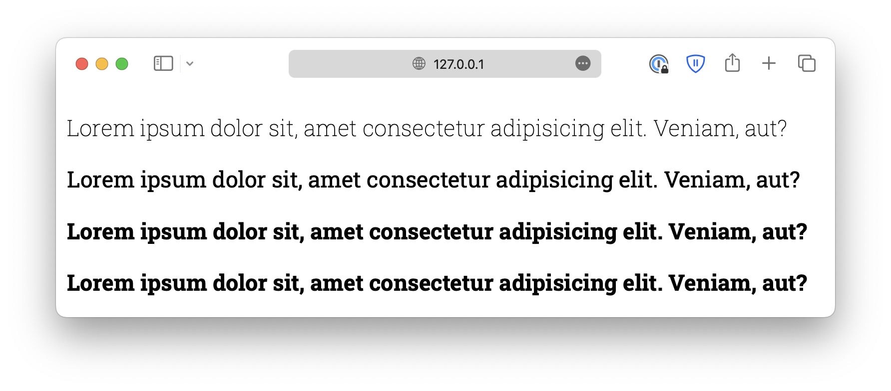
Alternatively, you can use numeric values 100, 200, and up to 900, with 100 being the lightest and 900 being the boldest.
However, you should know that many fonts do not have this many variants. You must ensure the fonts have the weight you need.
p {
  font-weight: 800;
}
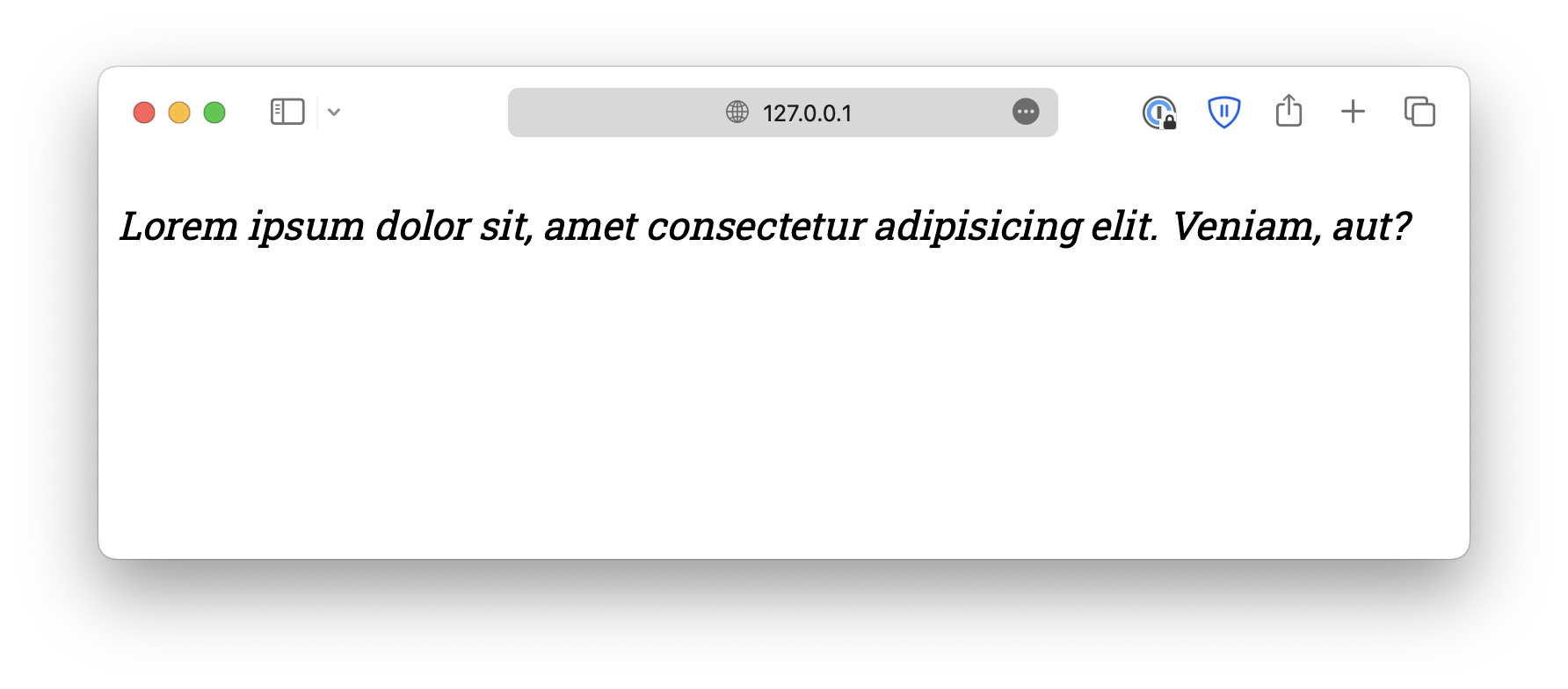
Font style
The font-style is used to define italic text. It can be either normal, italic, or oblique.
p {
  font-style: italic;
}
oblique is similar to italic but less supported, so it is rarely used.
The reason that oblique exists is that, if the browser supports it, it allows you to define an angle, which specifies precisely how much you want the letters to tilt.
.italic {
  font-style: italic;
}

.oblique {
  font-style: oblique 40deg;
}
Font variant
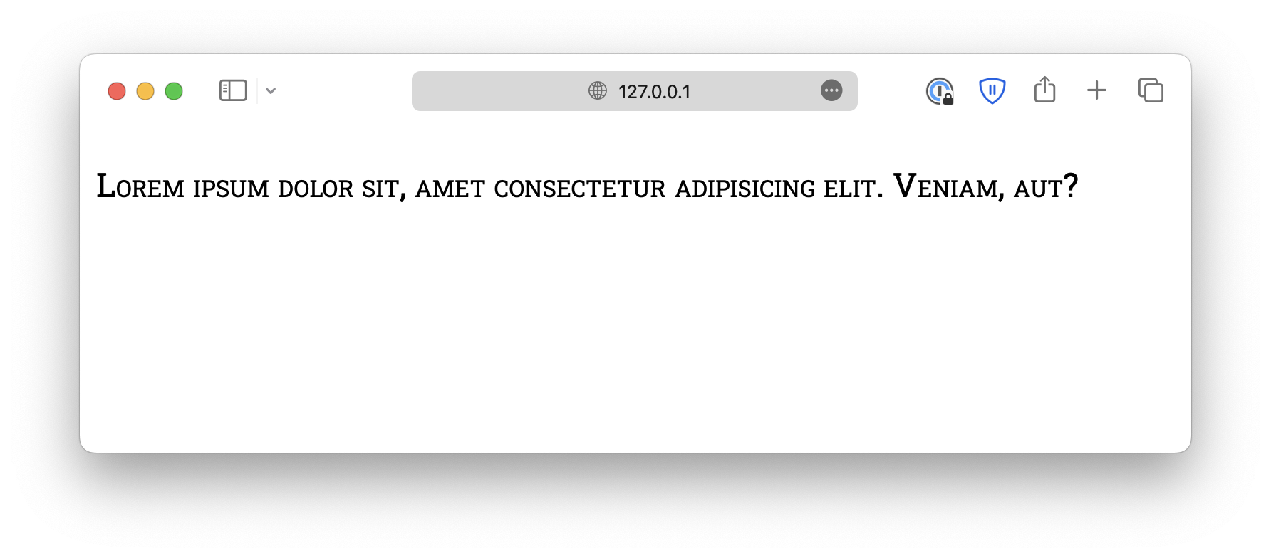
Lastly, the font-variant property defines whether the text should be displayed in small-caps, where lowercase letters are converted to uppercase, but smaller.
p {
  font-variant: small-caps;
}
<!DOCTYPE html>
<html lang="en">

<head>
  <meta charset="UTF-8">
  <meta name="viewport" content="width=device-width, initial-scale=1.0">
  <title>Document</title>

  <link rel="stylesheet" href="/styles.css">
</head>

<body>
  <p>Lorem ipsum dolor sit amet consectetur, adipisicing elit. Fugiat, reprehenderit?</p>
</body>

</html>