Customizing Texts Using CSS
Next, let's talk about the text properties.
Text decoration
We'll start with text decorations, which include a set of properties you can use to create decorative lines for the text.
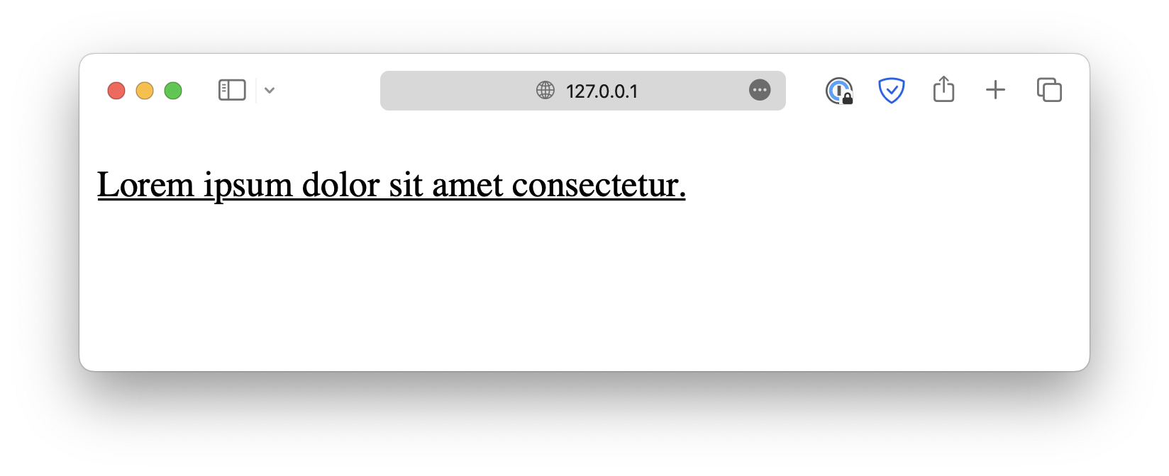
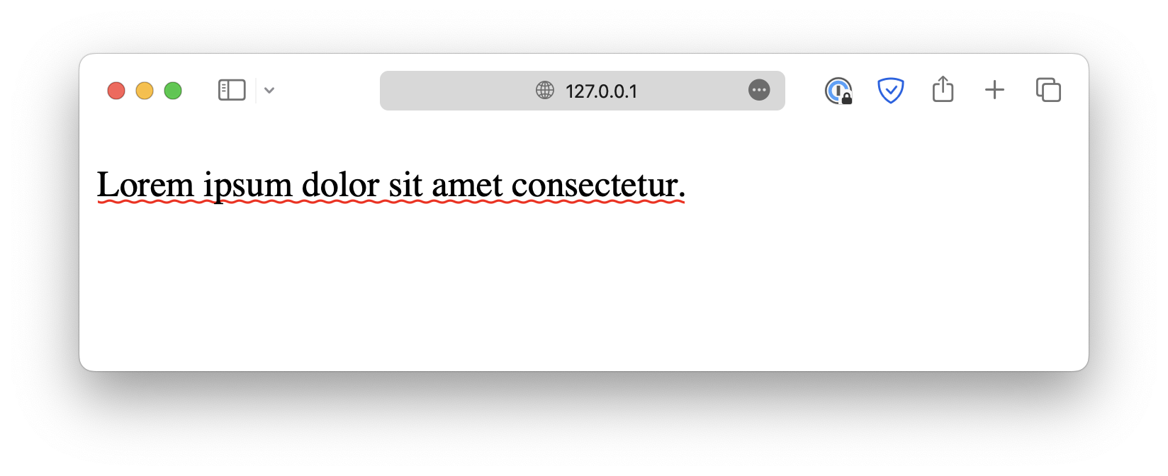
For example, by setting text-decoration-line to underline, you can add an underline like this:
p {
  text-decoration-line: underline;
}
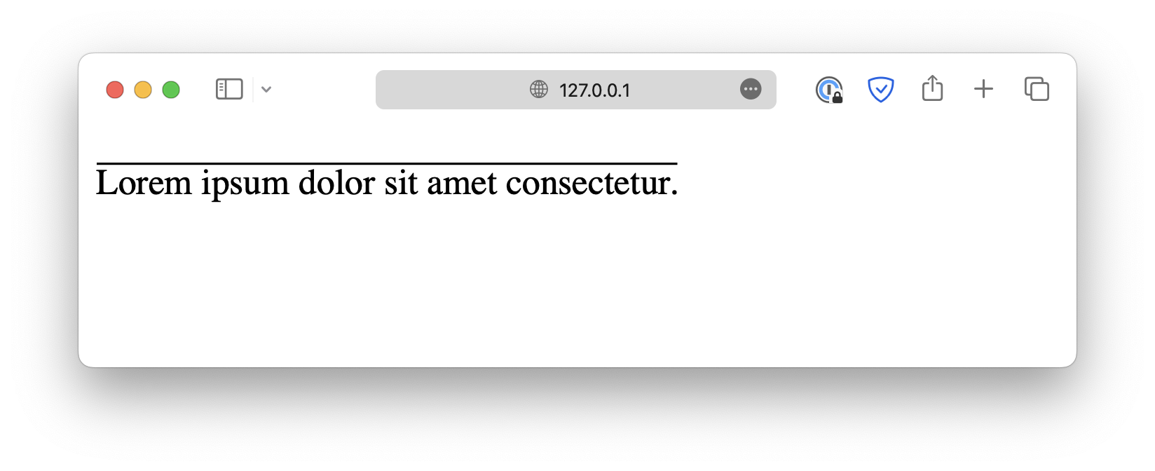
Other possible values include overline, which is a line displayed over the text:
p {
  text-decoration-line: overline;
}
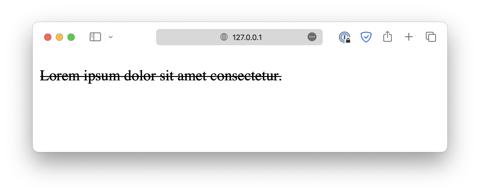
Or line-through, which is a line displayed across the text:
p {
  text-decoration-line: line-through;
}
The text-decoration-line property also allows you to specify multiple decoration lines by separating them with spaces:
p {
text-decoration-line: underline overline;
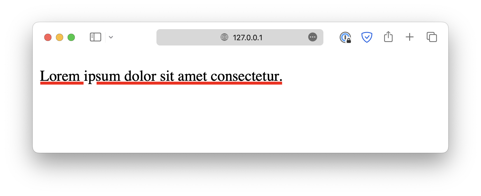
}Next, you can further customize the decorative line by specifying its color using text-decoration-color:
p {
  text-decoration-line: underline;
  text-decoration-color: red;
}
Or customize its thickness using text-decoration-thickness :
p {
  text-decoration-line: underline;
  text-decoration-color: red;
  text-decoration-thickness: 5px;
}
Or use the text-decoration-style property to define a style, such as dotted, wavy, and so on:
p {
  text-decoration-line: underline;
  text-decoration-color: red;
  text-decoration-style: wavy;
}
When the text-decoration-line is set to underline, you can customize the underline's offset using text-underline-offset:
p {
  text-decoration-line: underline;
  text-underline-offset: 4px;
}
This seems like a lot of work for just a decorative line. Luckily, CSS offers a shortcut, text-decoration. It allows you to define the type, style, thickness, and color simultaneously.
It follows the syntax shown below:
p {
  text-decoration: <text-decoration-line> <text-decoration-style>
    <text-decoration-color> <text-decoration-thickness>;
}p {
text-decoration: underline wavy red 2px;
}However, note that Safari does not yet support the text-decoration shorthand. You must use the individual properties discussed above if your webpage needs to be compatible with the browser.
Text shadow
The text-shadow property lets you add shadows to the text for more creative effects.
p {
  font-size: 50px;
  text-shadow: 5px 5px 2px red;
}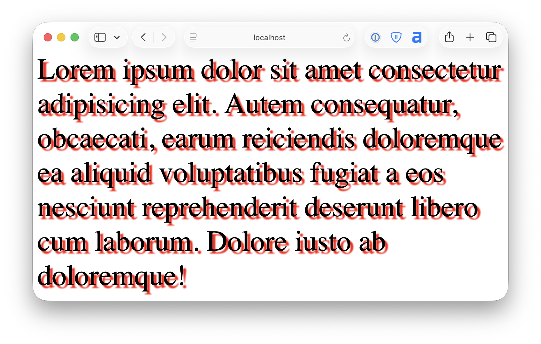
text-shadow accepts a list of values with the following syntax:
p {
  text-shadow: <offset-x> <offset-y> <blur-radius> <color>;
}
Text transform
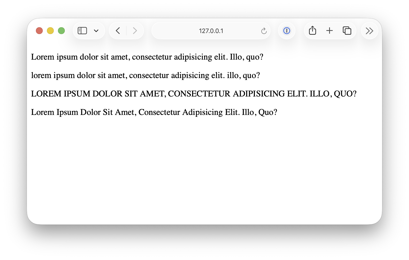
Lastly, text-transform lets you transform text to uppercase, lowercase, or capitalize the first letter of each word.
<p class="original">
  Lorem ipsum dolor sit amet, consectetur adipisicing elit. Illo, quo?
</p>

<p class="lowercase">
  Lorem ipsum dolor sit amet, consectetur adipisicing elit. Illo, quo?
</p>

<p class="uppercase">
  Lorem ipsum dolor sit amet, consectetur adipisicing elit. Illo, quo?
</p>

<p class="capitalize">
  Lorem ipsum dolor sit amet, consectetur adipisicing elit. Illo, quo?
</p>.lowercase {
text-transform: lowercase;
}
.uppercase {
text-transform: uppercase;
}
.capitalize {
text-transform: capitalize;
}
<!DOCTYPE html>
<html lang="en">

<head>
  <meta charset="UTF-8">
  <meta name="viewport" content="width=device-width, initial-scale=1.0">
  <title>Document</title>

  <link rel="stylesheet" href="/styles.css">
</head>

<body>
  <p>Lorem ipsum dolor sit amet consectetur, adipisicing elit. Fugiat, reprehenderit?</p>
</body>

</html>