How to Create Forms in HTML
Form is an essential component of your website, as it allows users to send data to the backend for processing.
It is created with the <form> element, acting as a container for different input fields.
<form>
  <input type="text" />
</form>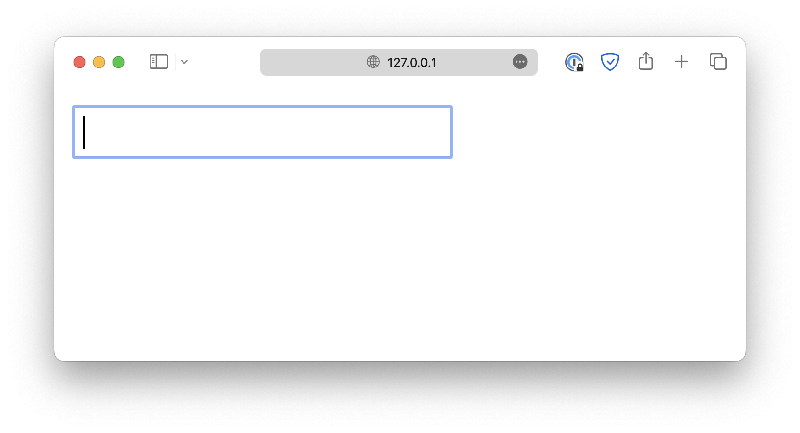
Pay attention to the type attribute.
<form>
  <input type="text" />
</form>
This allows the input field to be displayed in different types, such as checkboxes, color pickers, file upload fields, and more.
<form>
  <input type="text" />
  <input type="checkbox" />
  <input type="color" />
  <input type="file" />
</form>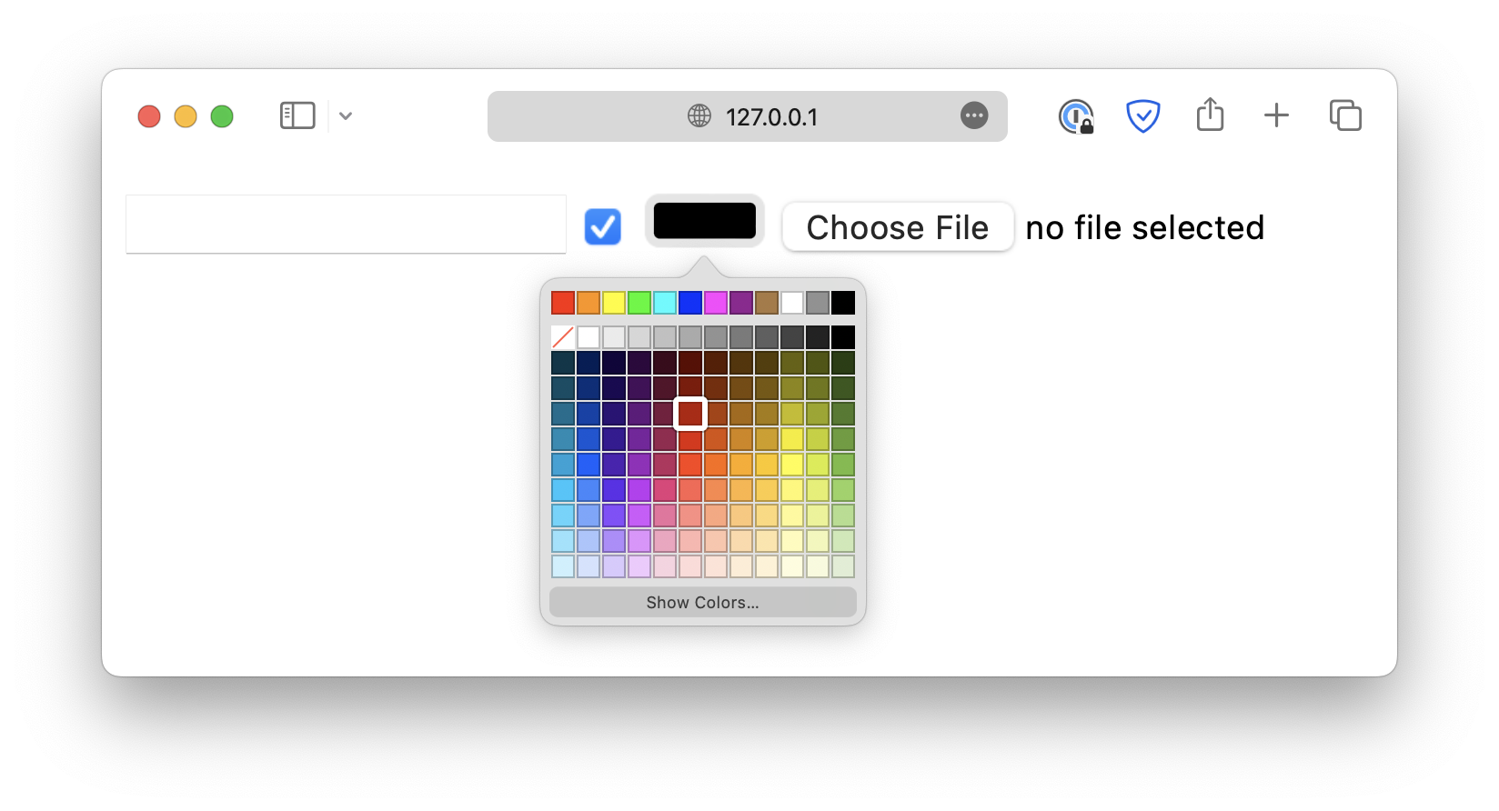
Every <input> field should be paired with a <label> to provide a clear description for that field.
<form>
  <label for="text_input">Your name:</label><br />
  <input type="text" id="text_input" /><br />

  <label for="checkbox_input">Confirm:</label><br />
  <input type="checkbox" id="checkbox_input"
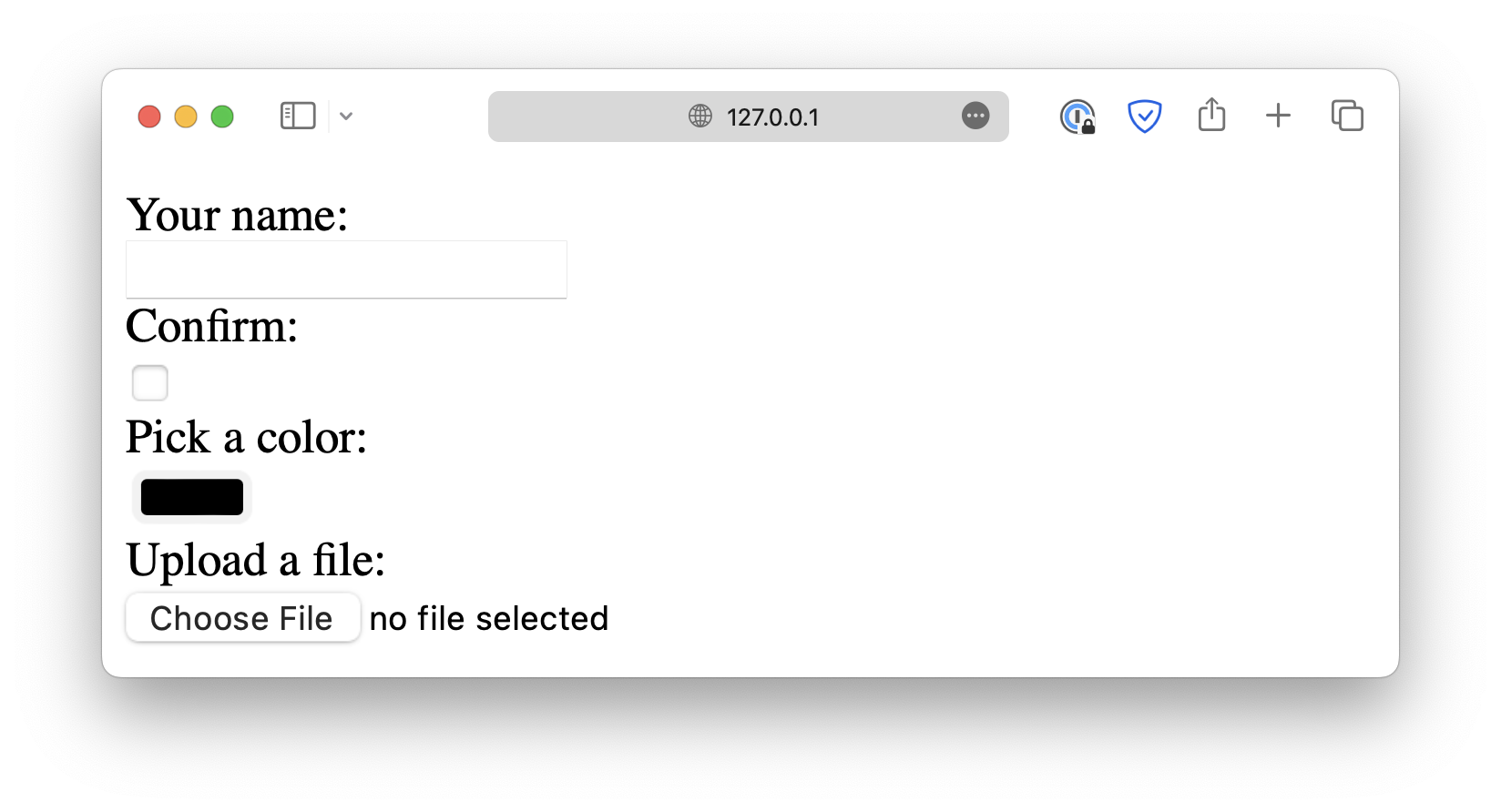
Make sure the for attribute of <label> matches the id of the corresponding <input>.
The <label> elements help users understand the purpose of the field and are particularly useful for screen reader users. When the user focuses on a field, the screen reader reads the corresponding label aloud.
<!DOCTYPE html>
<html lang="en">

<head>
  <meta charset="UTF-8">
  <meta name="viewport" content="width=device-width, initial-scale=1.0">
  <title>Document</title>

  <link rel="stylesheet" href="/styles.css">
</head>

<body>
  <form>
    <h2>Basic Inputs</h2>

    <label for="text">Text (required, placeholder)</label>
    <input
      type="text"
      id="text"
      name="text"
      placeholder="Enter your name"
      required />

    <label for="password">Password (minlength, maxlength)</label>
    <input
      type="password"
      id="password"
      name="password"
      minlength="6"
      maxlength="12" />

    <label for="email">Email (required)</label>
    <input type="email" id="email" name="email" required />

    <label for="url">URL (with default value)</label>
    <input type="url" id="url" name="url" value="https://example.com" />

    <label for="tel">Telephone (pattern)</label>
    <input
      type="tel"
      id="tel"
      name="tel"
      pattern="[0-9]{3}-[0-9]{3}-[0-9]{4}"
      placeholder="123-456-7890" />

    <label for="search">Search (placeholder)</label>
    <input type="search" id="search" name="search" placeholder="Search..." />

    <h2>Numeric & Date Inputs</h2>

    <label for="number">Number (min, max, step)</label>
    <input type="number" id="number" name="number" min="1" max="10" step="1" />

    <label for="range">Range (0–100)</label>
    <input type="range" id="range" name="range" min="0" max="100" />

    <label for="date">Date</label>
    <input type="date" id="date" name="date" />

    <label for="time">Time</label>
    <input type="time" id="time" name="time" />

    <label for="month">Month</label>
    <input type="month" id="month" name="month" />

    <label for="week">Week</label>
    <input type="week" id="week" name="week" />

    <label for="datetime-local">Datetime Local</label>
    <input type="datetime-local" id="datetime-local" name="datetime-local" />

    <h2>Special Inputs</h2>

    <label for="color">Color Picker</label>
    <input type="color" id="color" name="color" />

    <div class="group">
      <input type="checkbox" id="checkbox" name="checkbox" />
      <label for="checkbox">Checkbox</label>
    </div>

    <div class="group">
      <input type="radio" id="radio1" name="radio" value="1" />
      <label for="radio1">Radio 1</label>
      <input type="radio" id="radio2" name="radio" value="2" />
      <label for="radio2">Radio 2</label>
    </div>

    <label for="file">File Upload (multiple)</label>
    <input type="file" id="file" name="file" multiple />

    <h2>Select & Textarea</h2>

    <label for="select">Select Dropdown (disabled option)</label>
    <select id="select" name="select">
      <option value="">-- Please choose --</option>
      <option value="a">Option A</option>
      <option value="b" disabled>Option B (disabled)</option>
      <option value="c">Option C</option>
    </select>

    <label for="multi-select">Multi Select</label>
    <select id="multi-select" name="multi-select" multiple size="3">
      <option value="1">One</option>
      <option value="2">Two</option>
      <option value="3">Three</option>
    </select>

    <label for="textarea">Textarea (readonly)</label>
    <textarea id="textarea" name="textarea" rows="4" readonly>
      This is a read-only message.</textarea>

    <h2>Hidden & Disabled</h2>

    <input type="hidden" name="userId" value="12345" />

    <label for="disabled">Disabled Input</label>
    <input
      type="text"
      id="disabled"
      name="disabled"
      value="Can't edit"
      disabled />

    <h2>Actions</h2>

    <button type="submit">Submit</button>
    <button type="reset">Reset</button>
  </form>
</body>

</html>