Creating a Flexbox Layout Using CSS
The flexbox is another layout model in CSS that provides a more flexible approach when designing complex layouts.
Similar a grid layout, a flexbox is made of a flex container and several flex items.
The container should have its display property set to flex, and all of its direct children automatically become flex items.
<div class="container">
  <div class="item">1</div>
  <div class="item">2</div>
  <div class="item">3</div>
  <div class="item">4</div>
  <div class="item">5</div>
  <div class="item">6</div>
</div>.container {
display: flex;
gap: 10px;
}Flex direction
With a flex layout, instead of rows and columns, you must define a flex-direction and a flex-wrap.
The flex-direction specifies in which direction the container should stack its flex items.
The accepted values are:
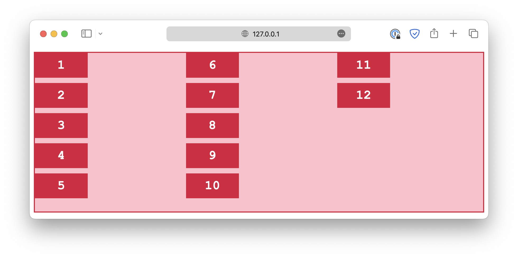
column
.container {
  flex-direction: column;
}
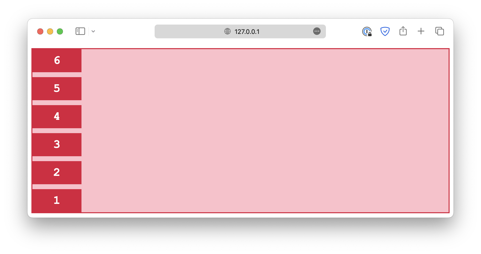
column-reverse
.container {
  flex-direction: column-reverse;
}
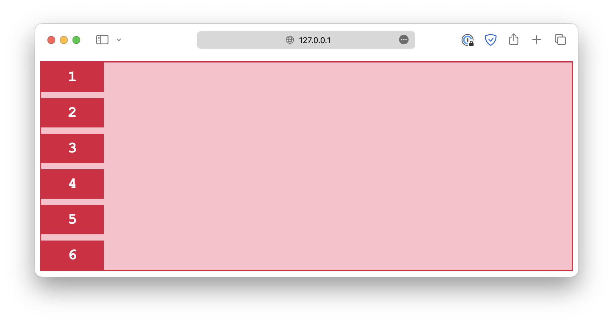
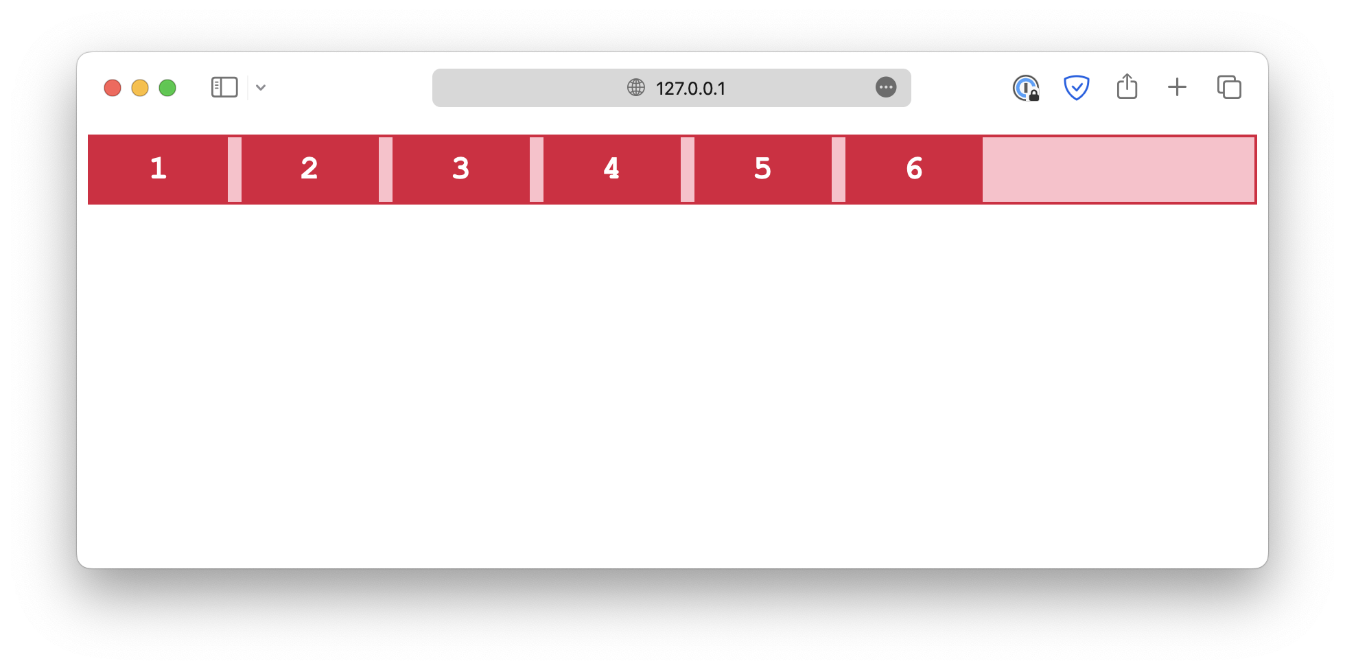
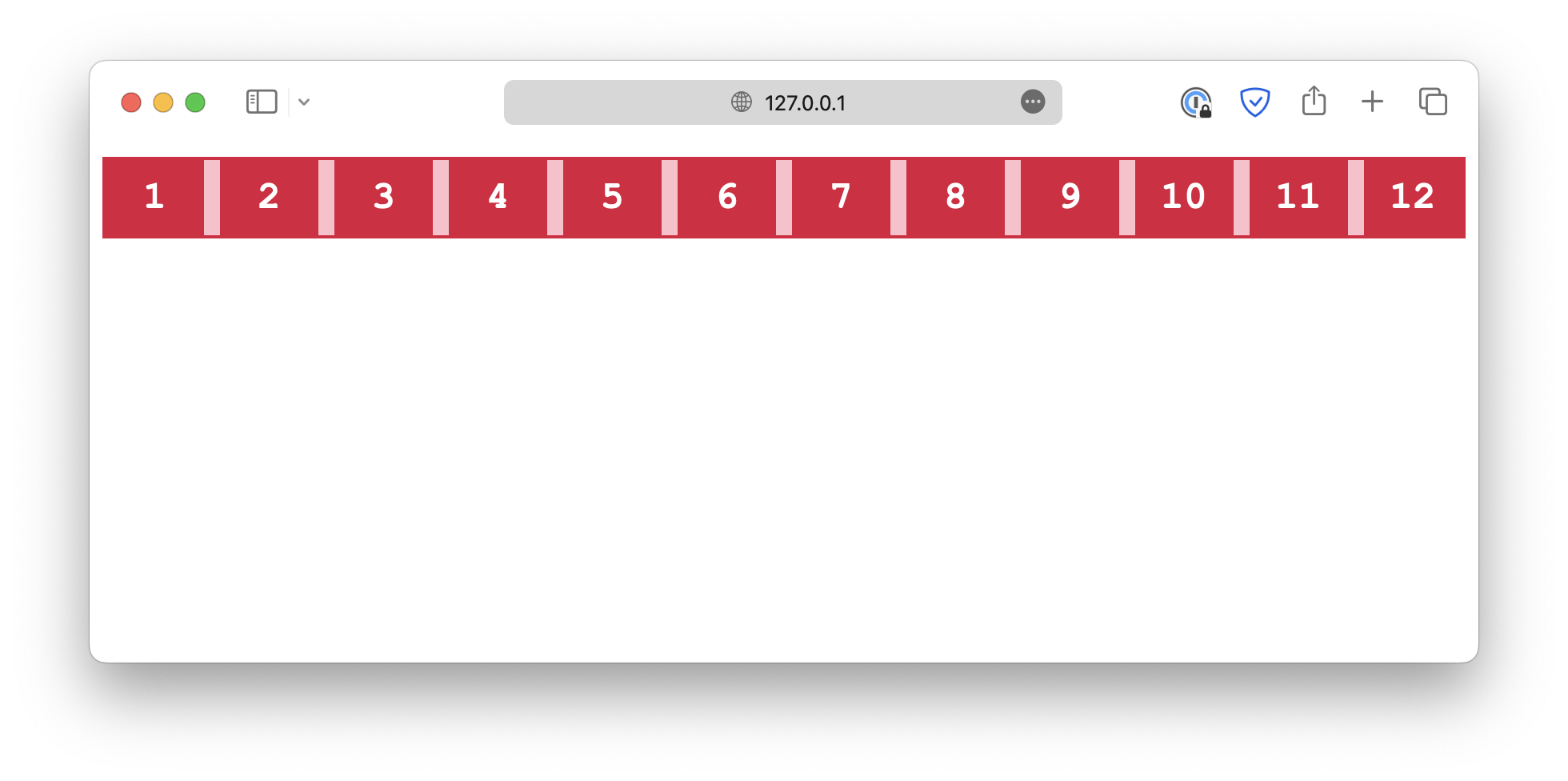
row
.container {
  flex-direction: row;
}
row-reverse
.container {
  flex-direction: row-reverse;
}
Flex wrap
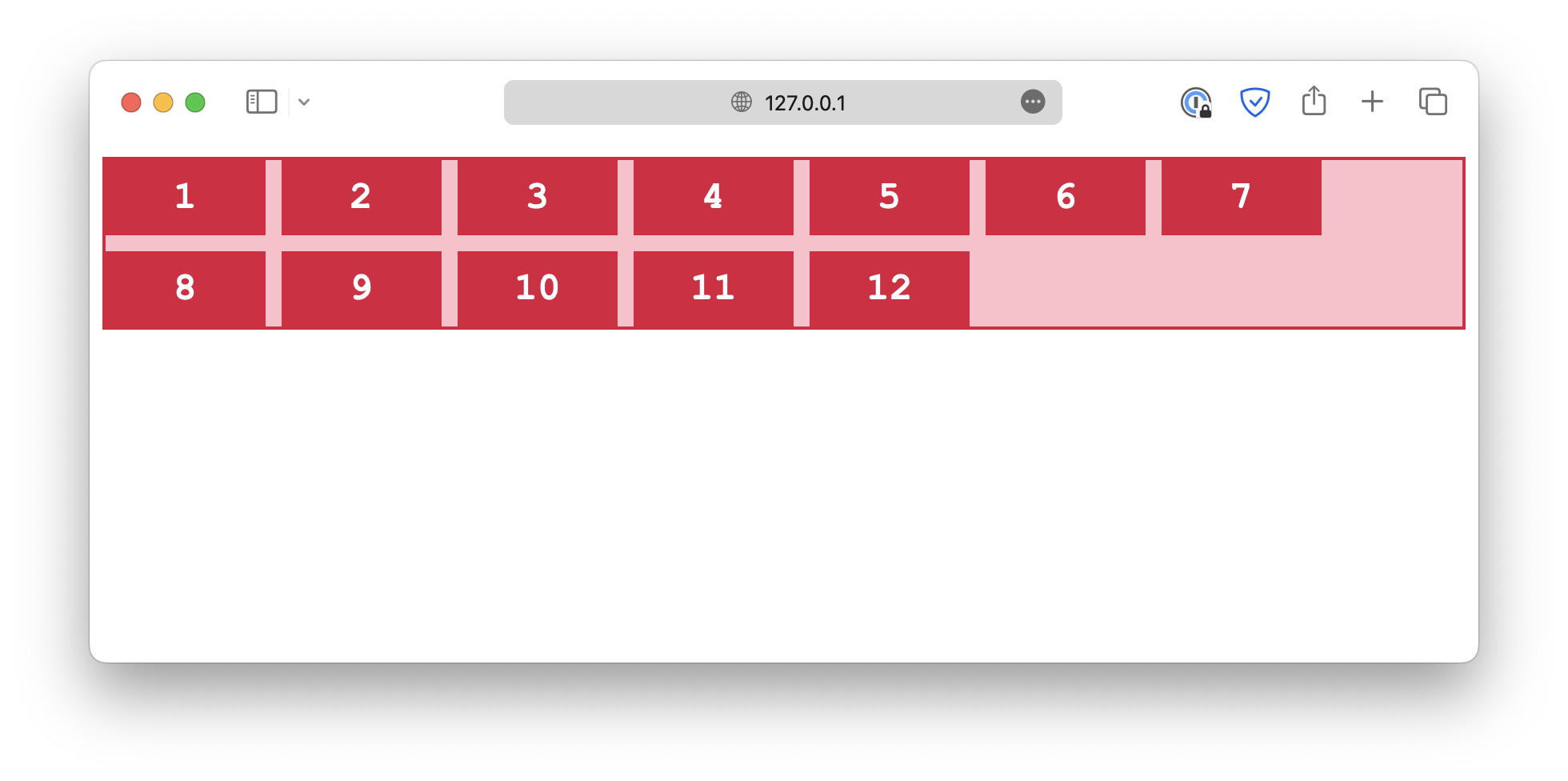
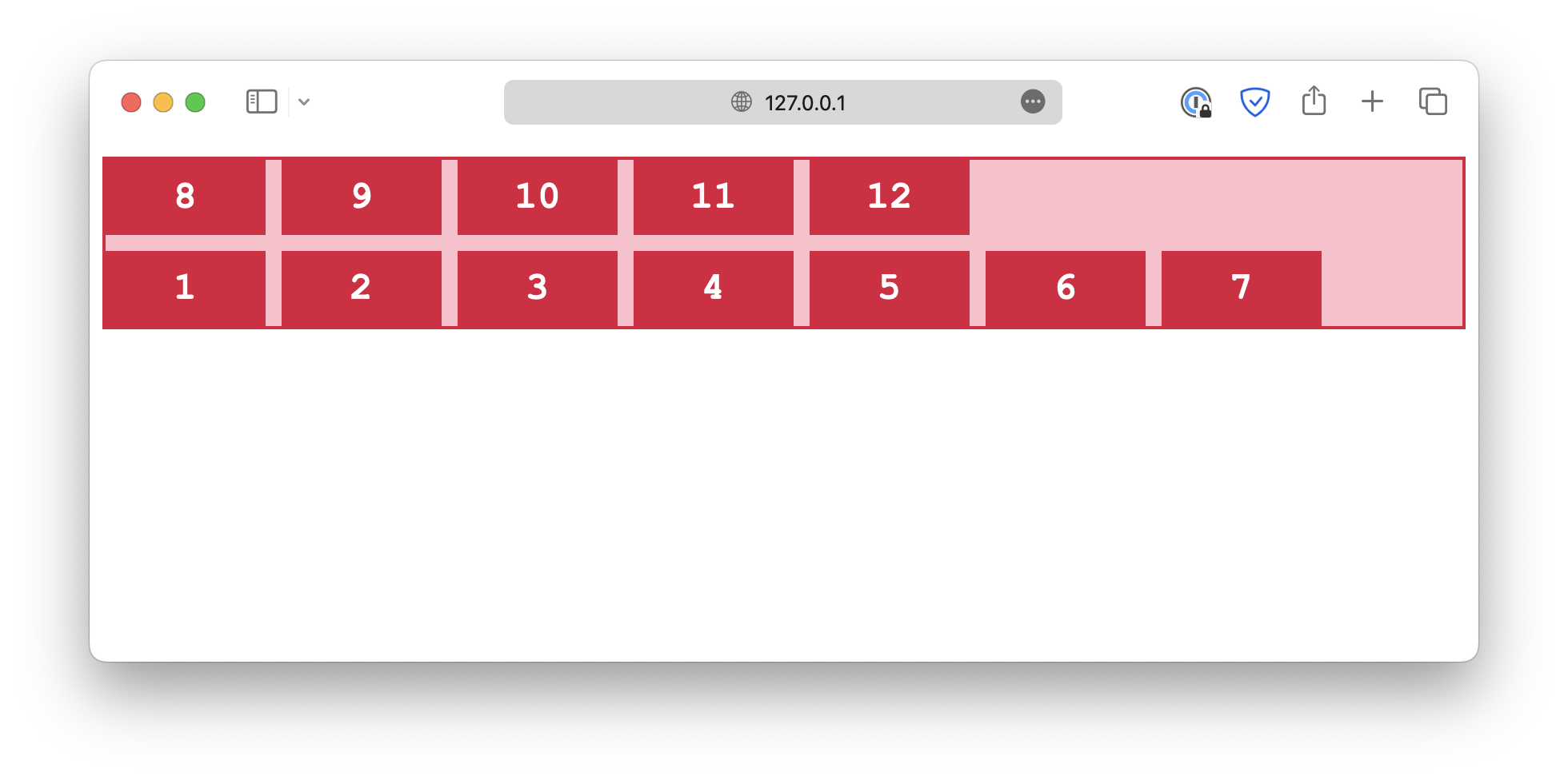
The flex-wrap property determines whether the flex items should wrap, which means automatically change to the next line when there is insufficient space.
wrap
.container {
  flex-wrap: wrap;
}
nowrap
.container {
  flex-wrap: nowrap;
}
wrap-reverse
.container {
  flex-wrap: wrap-reverse;
}
Flex flow
The flex-flow is a shorthand for both flex-direction and flex-wrap properties.
.container {
  flex-flow: column wrap;
}
<!DOCTYPE html>
<html lang="en">

<head>
  <meta charset="UTF-8">
  <meta name="viewport" content="width=device-width, initial-scale=1.0">
  <title>Document</title>

  <link rel="stylesheet" href="/styles.css">
</head>

<body>

  <div class="container">
    <div class="item">1</div>
    <div class="item">2</div>
    <div class="item">3</div>
    <div class="item">4</div>
    <div class="item">5</div>
    <div class="item">6</div>
  </div>

</body>

</html>