How to Create a Grid Layout Using CSS
When it comes to grid alignment, we have to talk about both row and column directions.
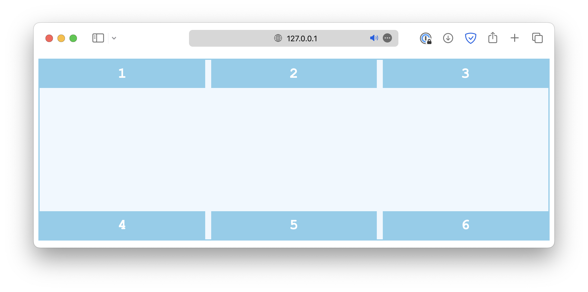
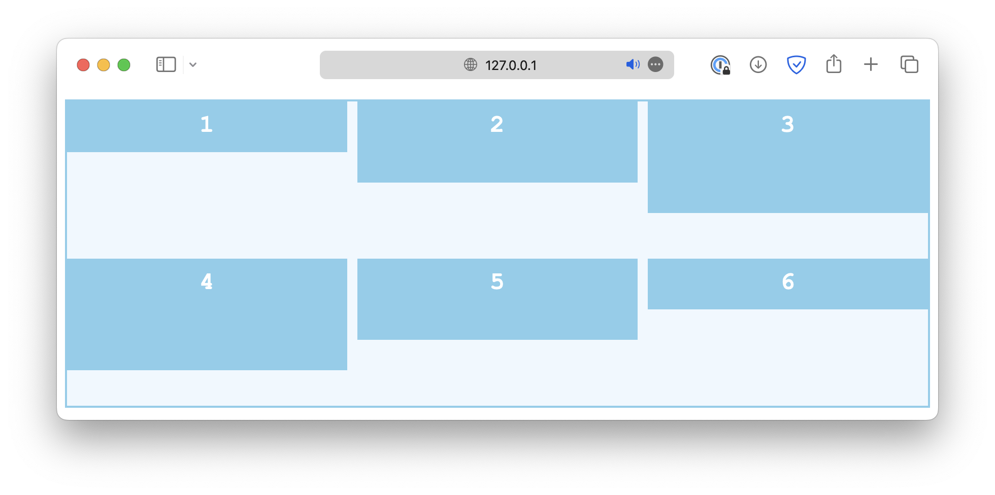
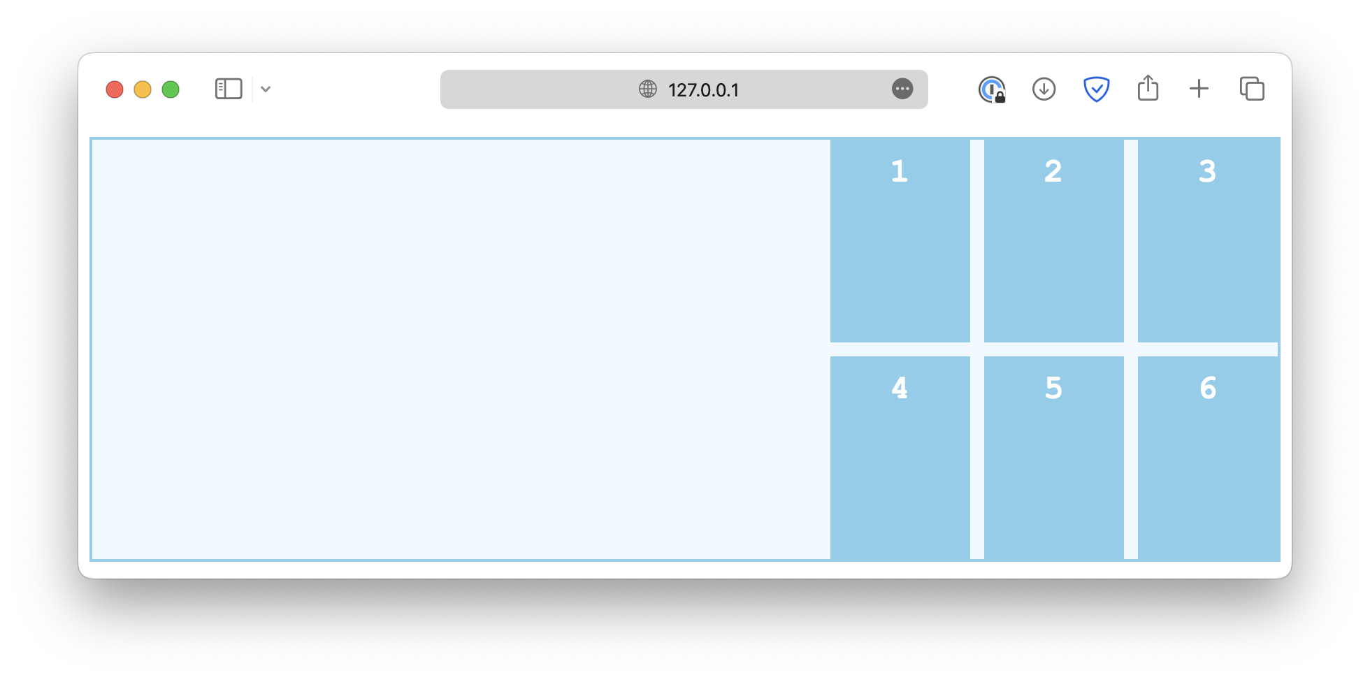
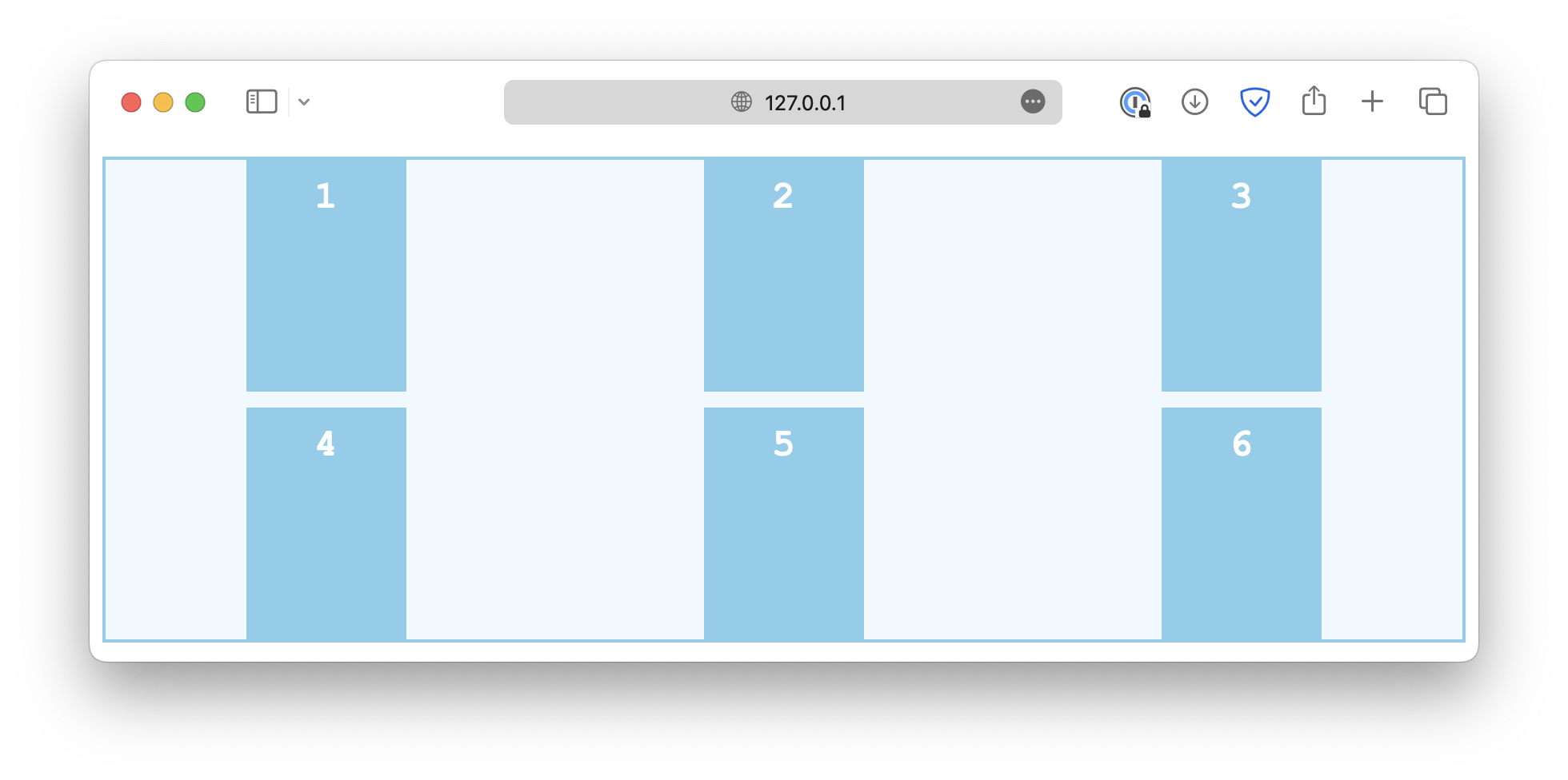
Content alignment along column axis
When the total height of the grid items is less than the height of the grid container, for example:
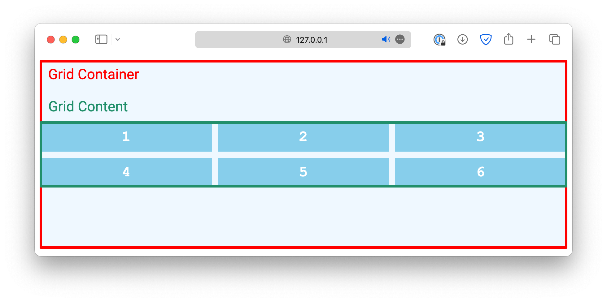
You can use the align-content property to specify how the grid content is positioned within the container.
.container {
/* . . . */
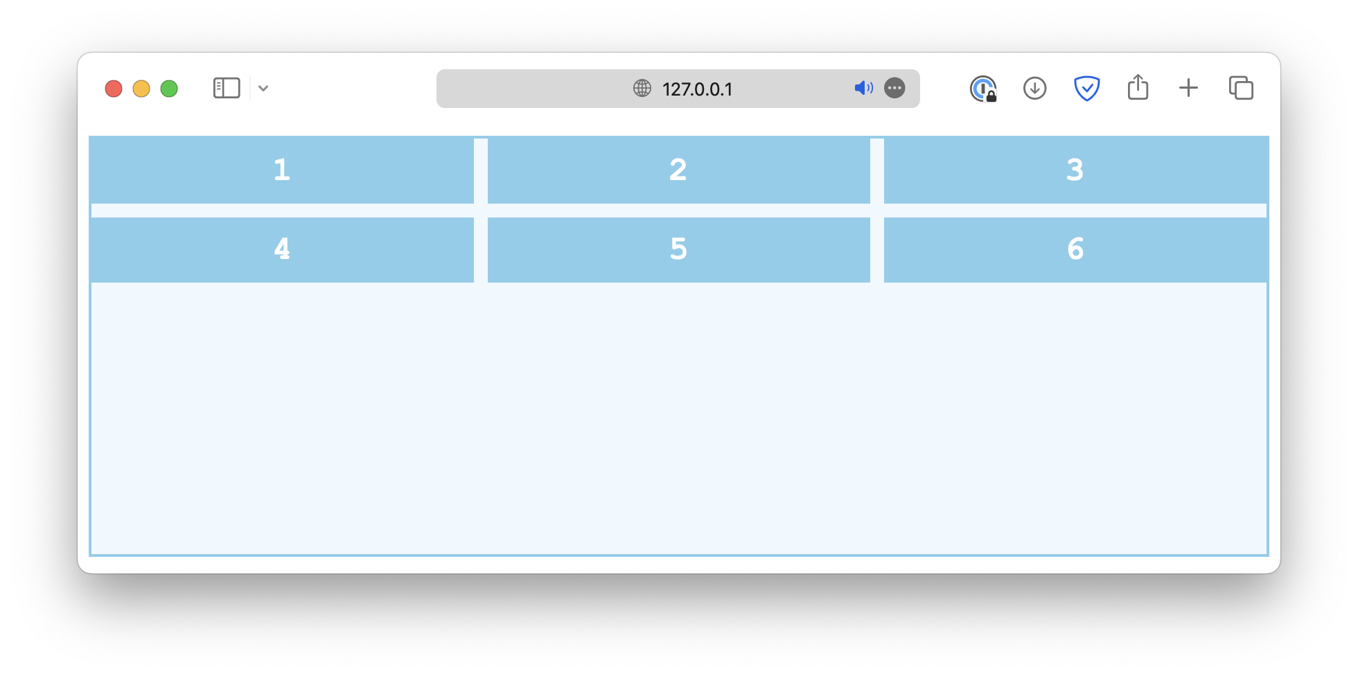
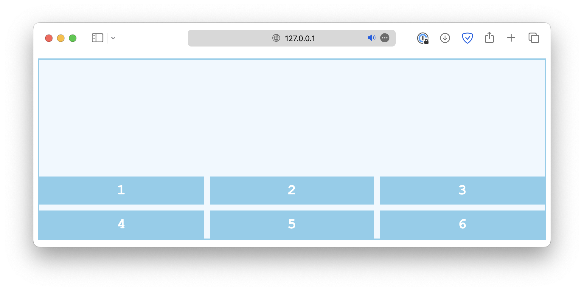
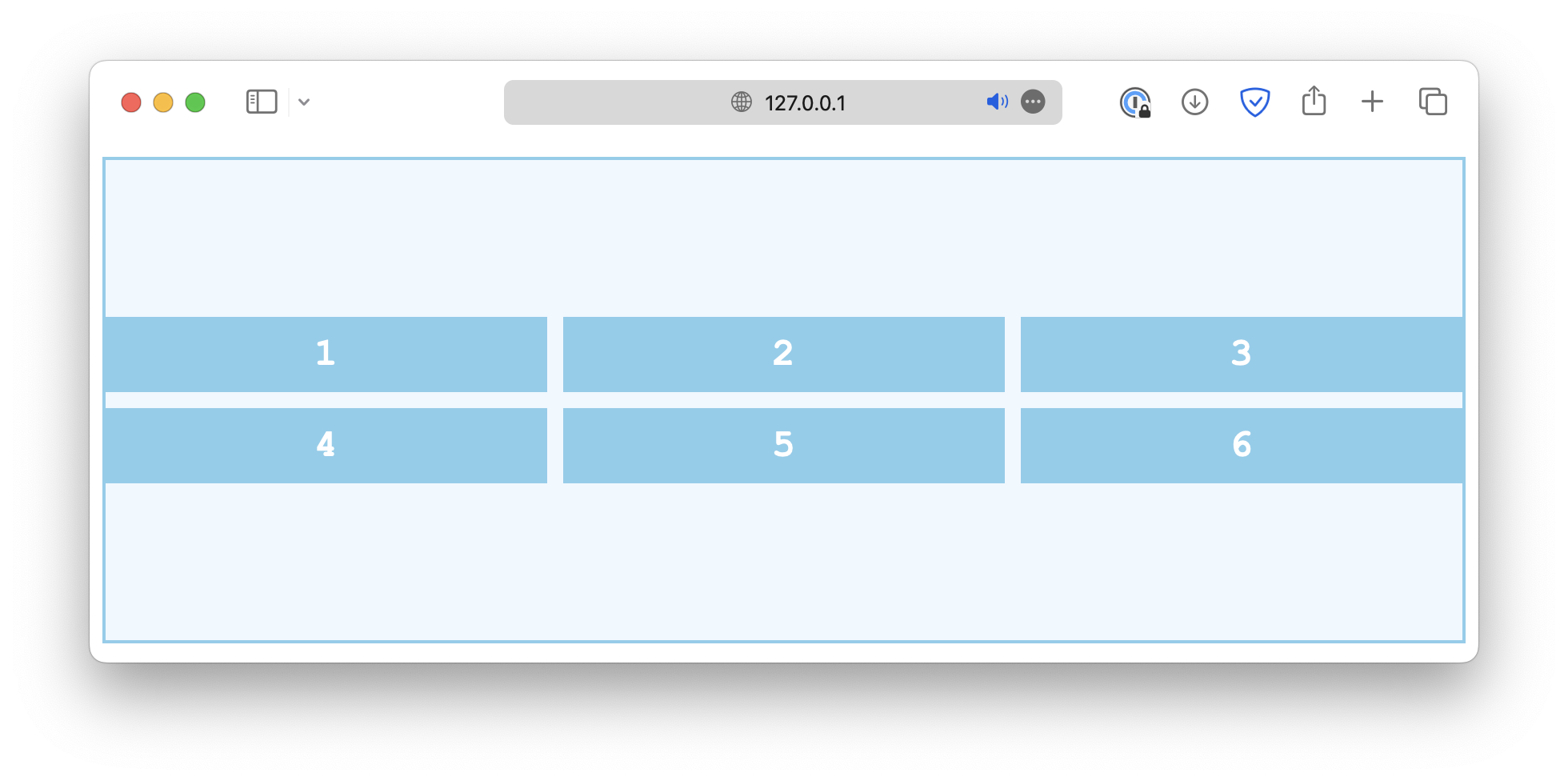
align-content: start;
}The common values include:
start
end
center
space-between
space-around
space-evenly
stretch
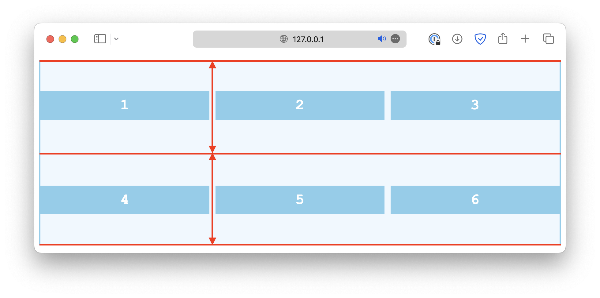
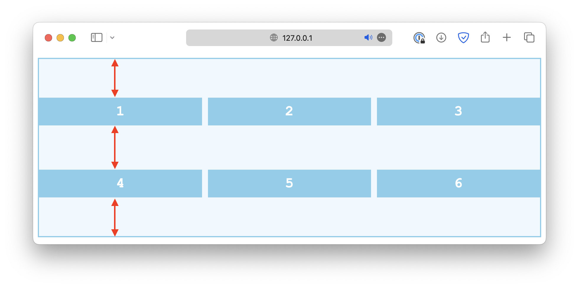
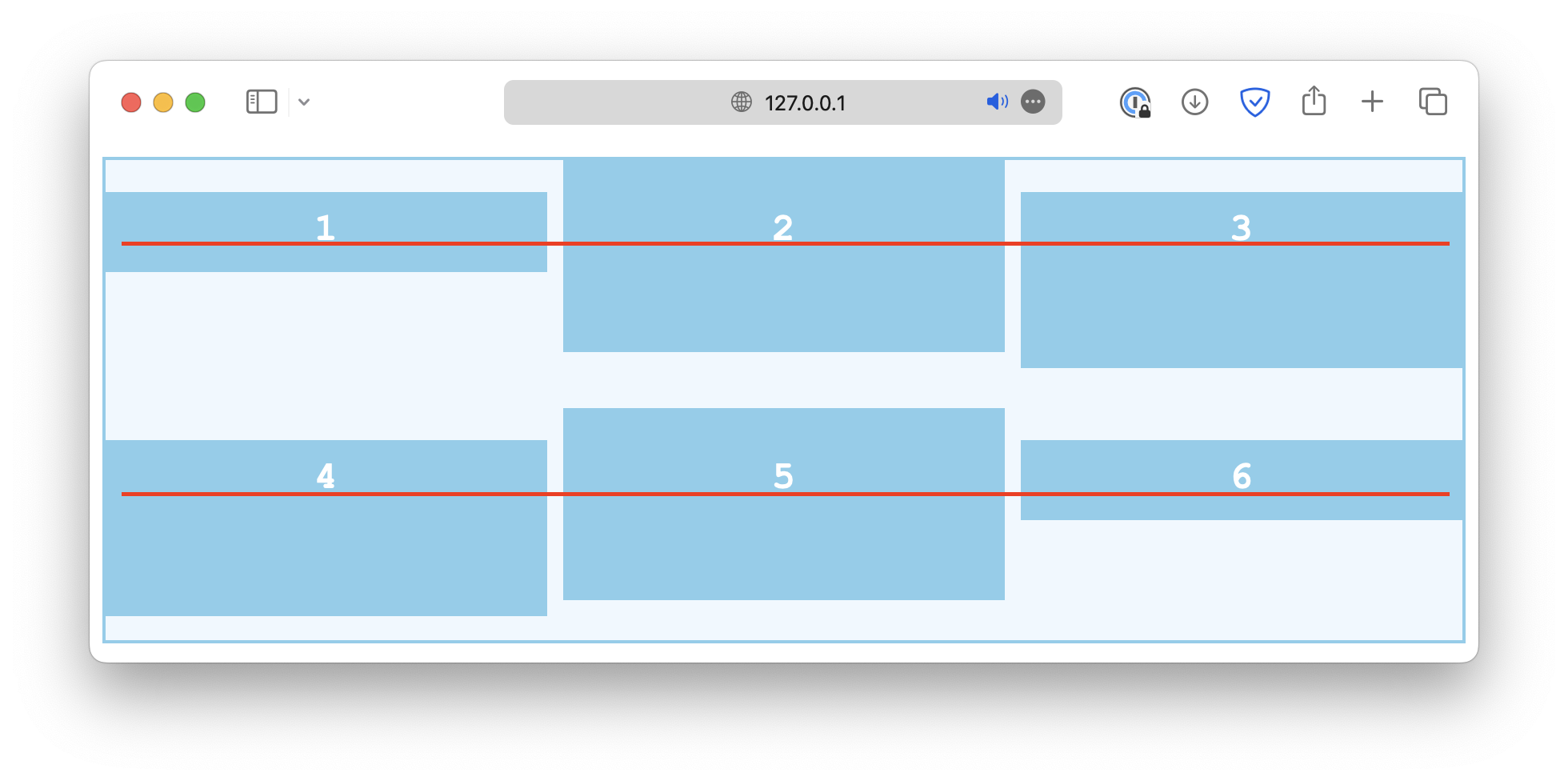
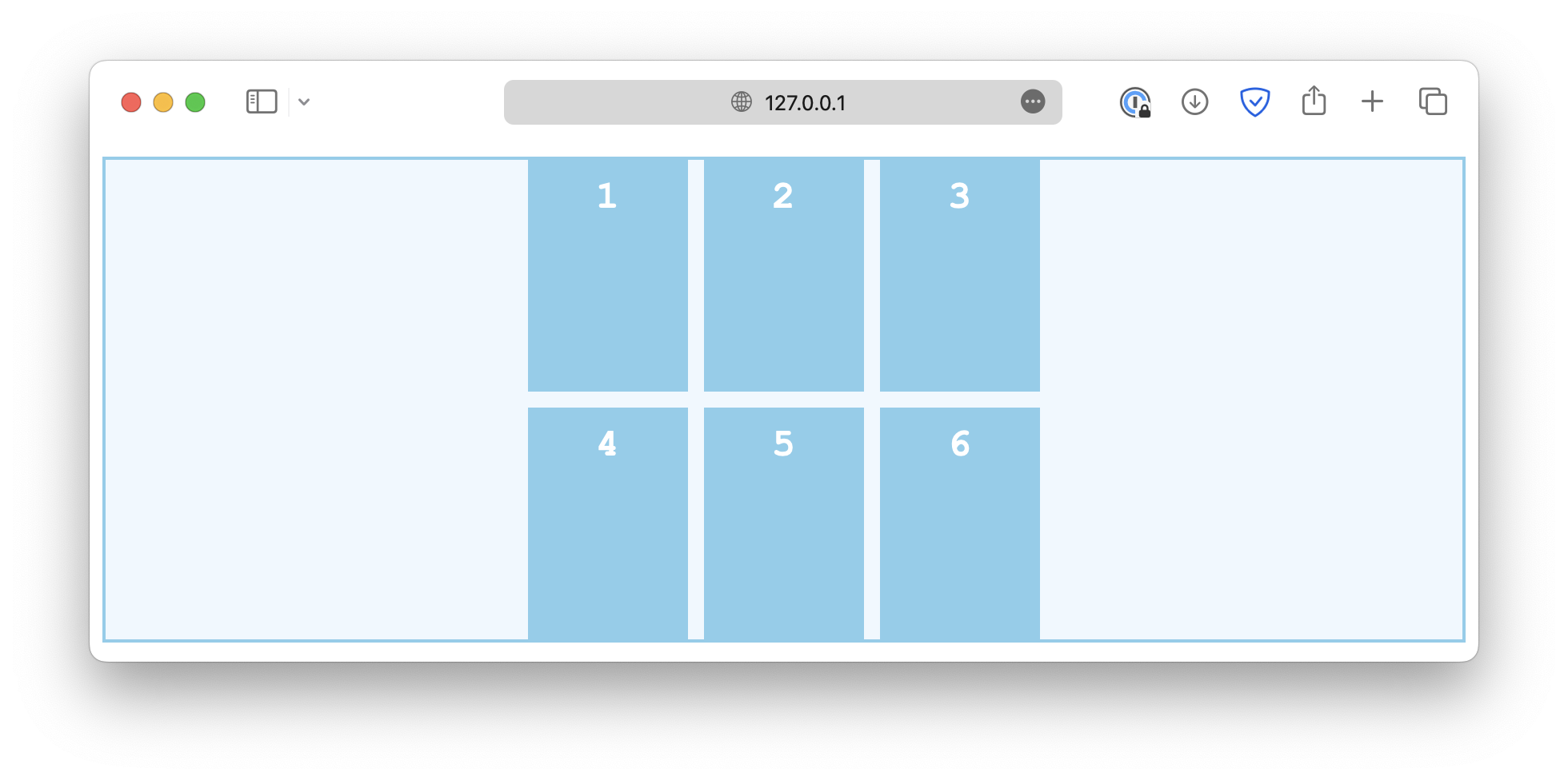
Item alignment along column axis
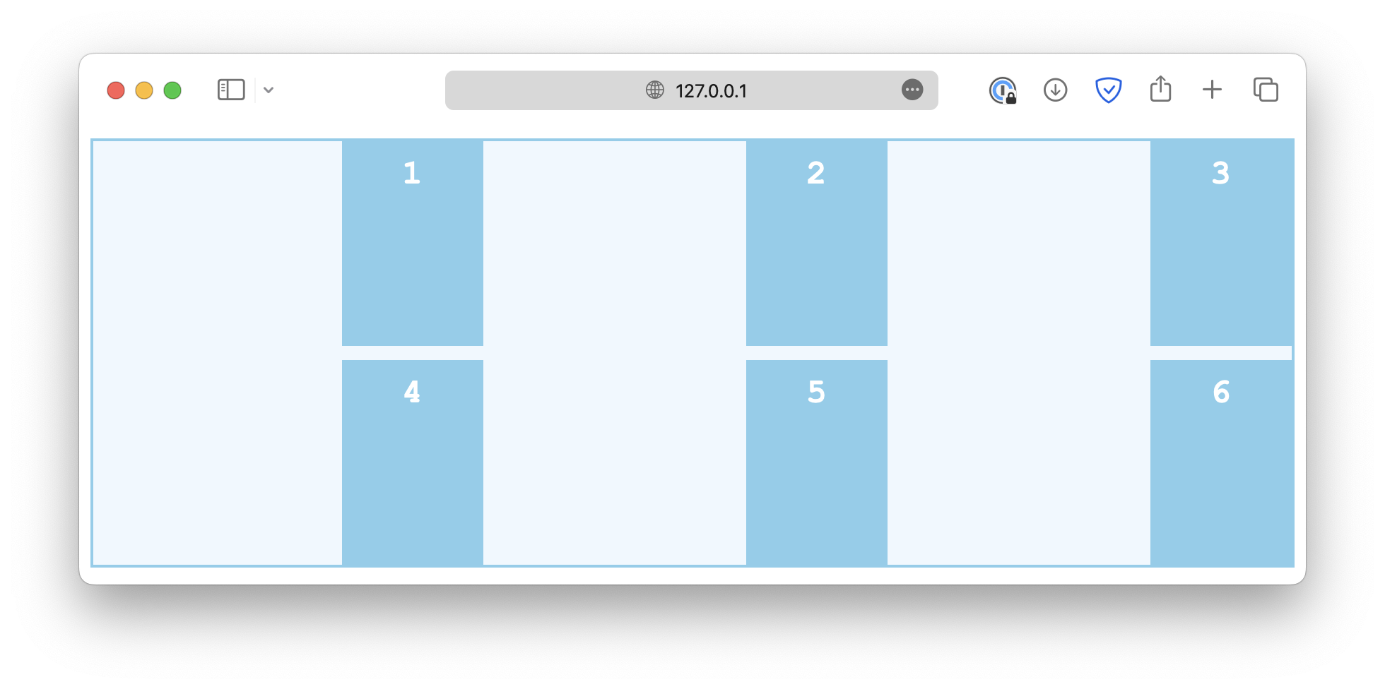
align-items determines how the grid items are positioned along the column axis, within their respective cell.
.container {
  align-items: start;
}
Common values include:
start
end

center

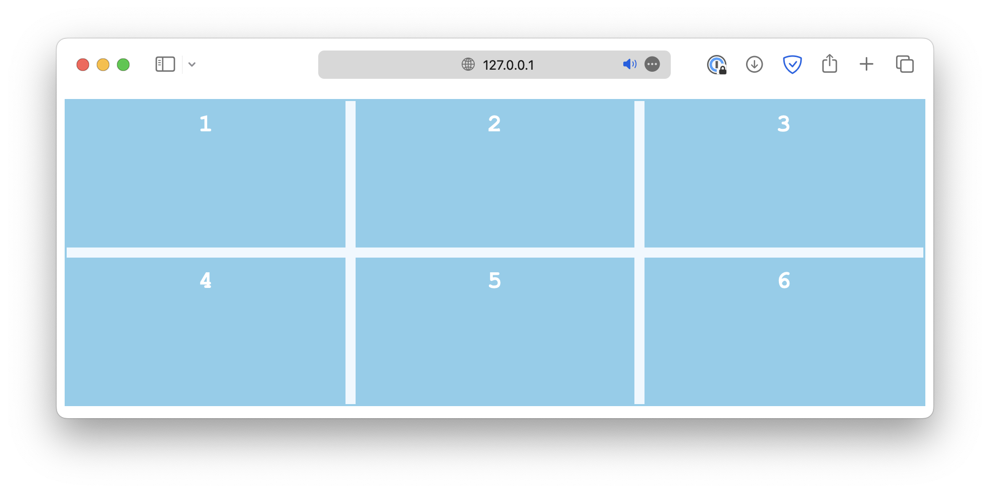
stretch

baseline
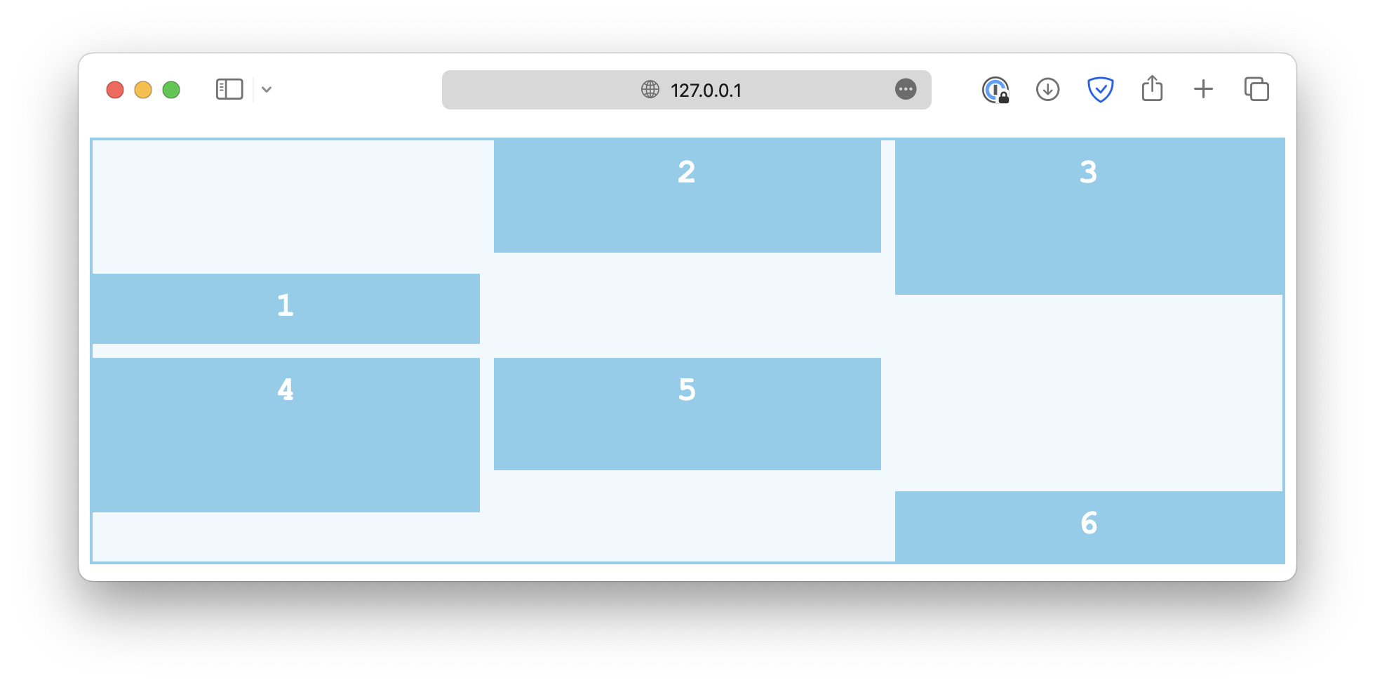
Single item alignment along column axis
There is also an align-self property that works just like align-items, except it is used on individual grid items instead of the container.
If the container has the align-items set, it will be overwritten by align-self.
.container {
  align-items: start;
}

#Item {
  align-self: end; /* This will overwrite the align-items rule for this item */
}
Content alignment along row axis
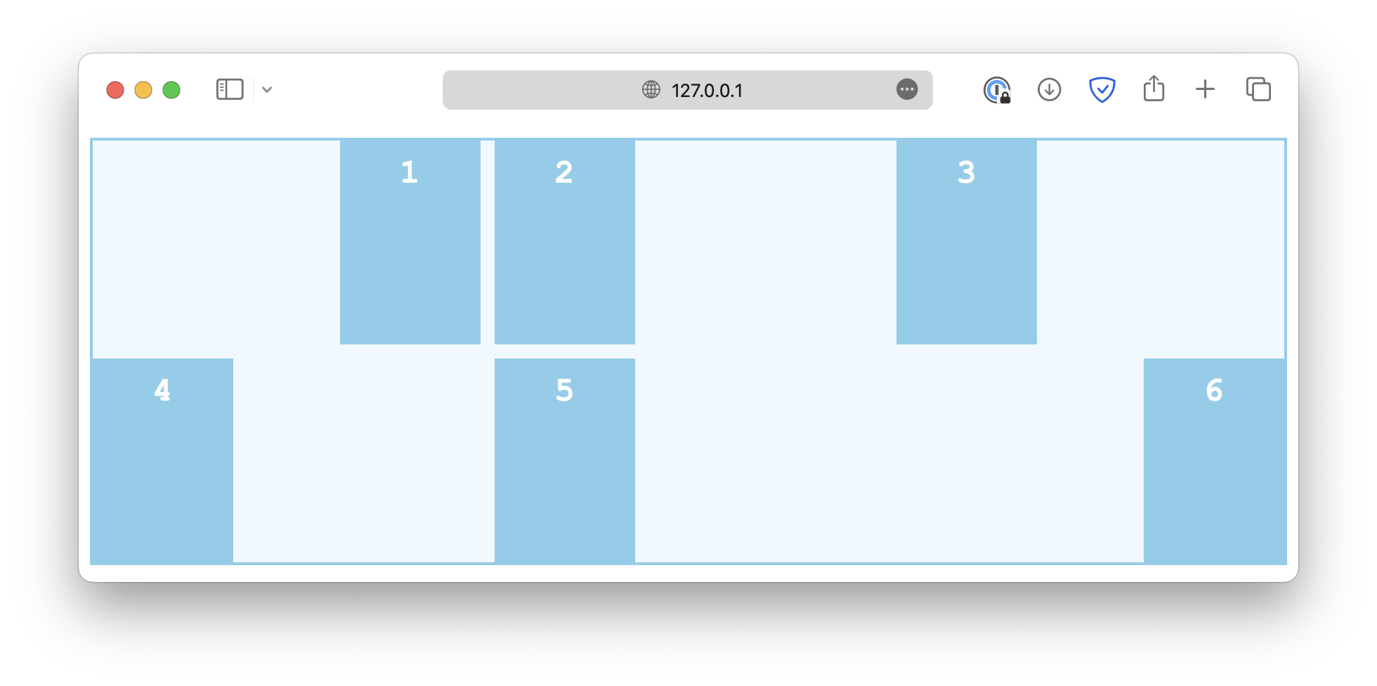
The alignment along the row axis is controlled by the justify properties, which work in a similar way.
First, the justify-content property defines how grid content is positioned along the row axis.
.container {
  justify-content: start;
}
Some common values are:
start
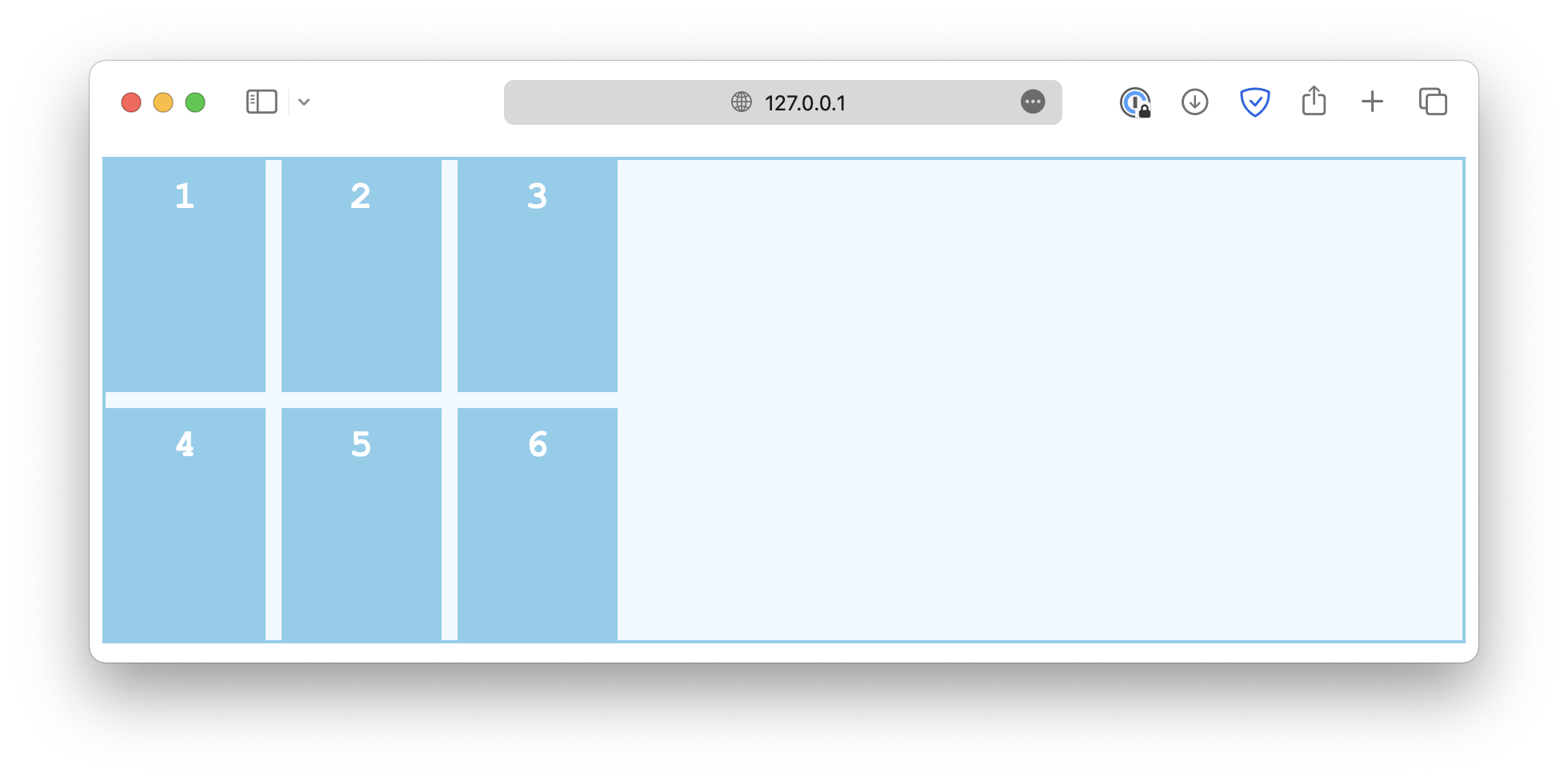
end
center
space-between
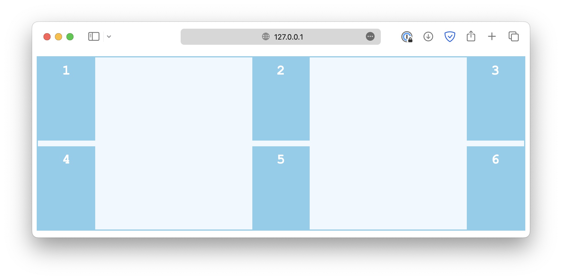
space-around

space-evenly

Item alignment along row axis
The justify-items controls how grid items are aligned horizontally within their cells.
.container {
  justify-items: start;
}
Some common values are:
start
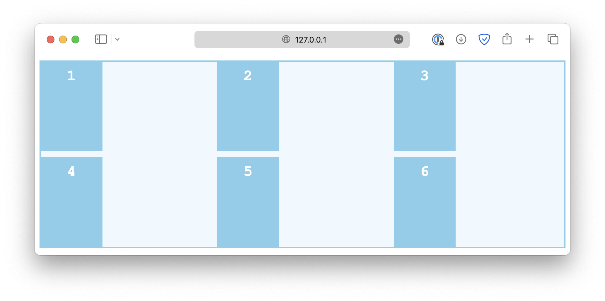
end
center
stretch
Single item alignment along row axis
Similarly, the justify-self property is used on individual grid items to overwrite the default alignment rule set by justify-items.
.container {
  justify-items: start;
}

.item-sm {
  justify-self: end;
}
Alignment in both directions
The place properties are a set of shorthand properties that control how the items are justified and aligned simultaneously. For example,
.container {
  display: grid;
  grid-template-columns: auto auto auto;
  gap: 10px;
  height: 300px;

  place-content: center;
}
This is the same as:
.container {
  display: grid;
  grid-template-columns: auto auto auto;
  gap: 10px;
  height: 300px;

  align-content: center;
  justify-content: center;
}
Besides place-content, there is also a place-items and place-self that work in a similar manner.
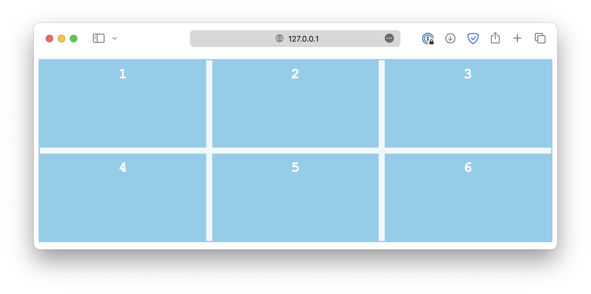
<!DOCTYPE html>
<html lang="en">

<head>
  <meta charset="UTF-8">
  <meta name="viewport" content="width=device-width, initial-scale=1.0">
  <title>Document</title>

  <link rel="stylesheet" href="/styles.css">
</head>

<body>
  <div class="container">
    <div class="item">1</div>
    <div class="item">2</div>
    <div class="item">3</div>
    <div class="item">4</div>
    <div class="item">5</div>
    <div class="item">6</div>
  </div>
</body>

</html>