Creating a Flexbox Layout Using CSS
When it comes to alignment and justification for a flex layout, we have a slightly different approach.
Instead of row and column alignments, the justify properties deal with the alignment in the flexbox's main axis, which depends on the flex-direction property.
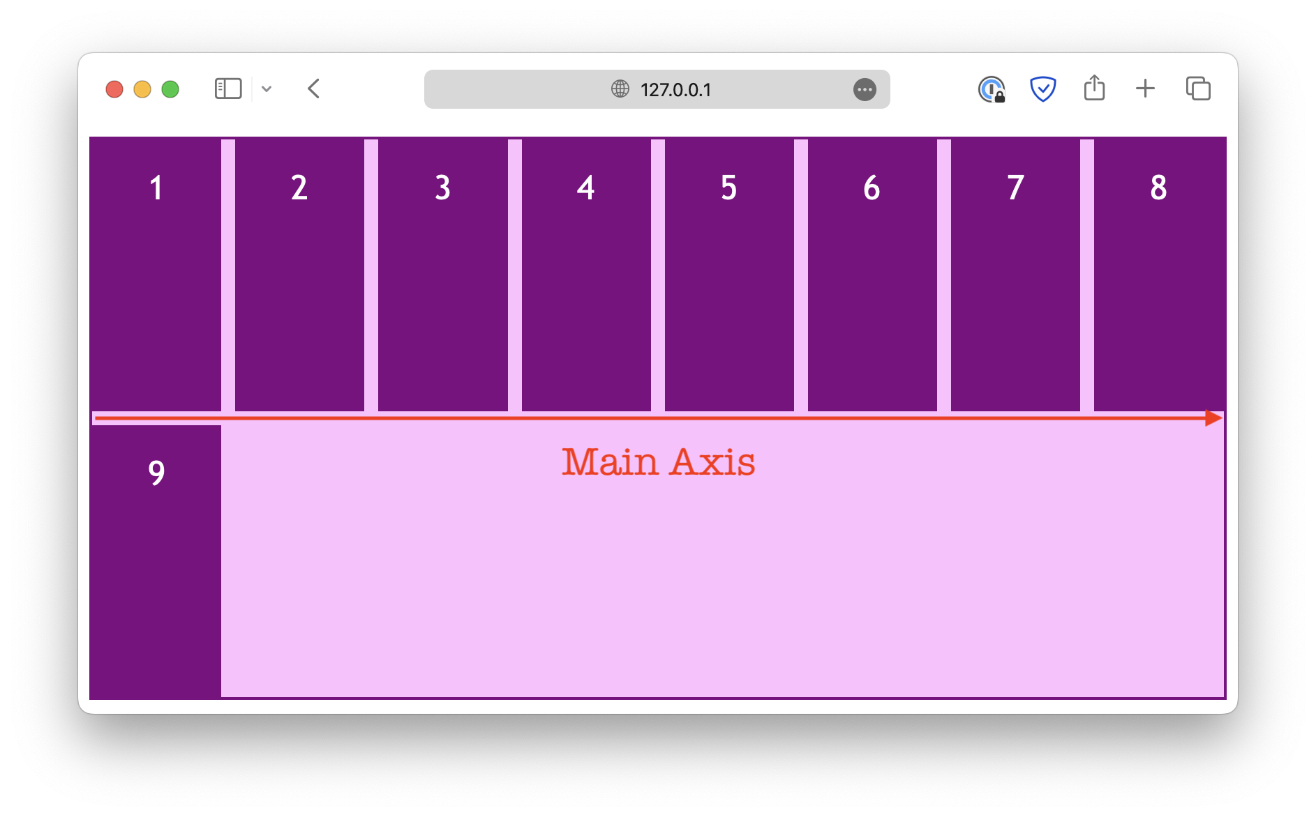
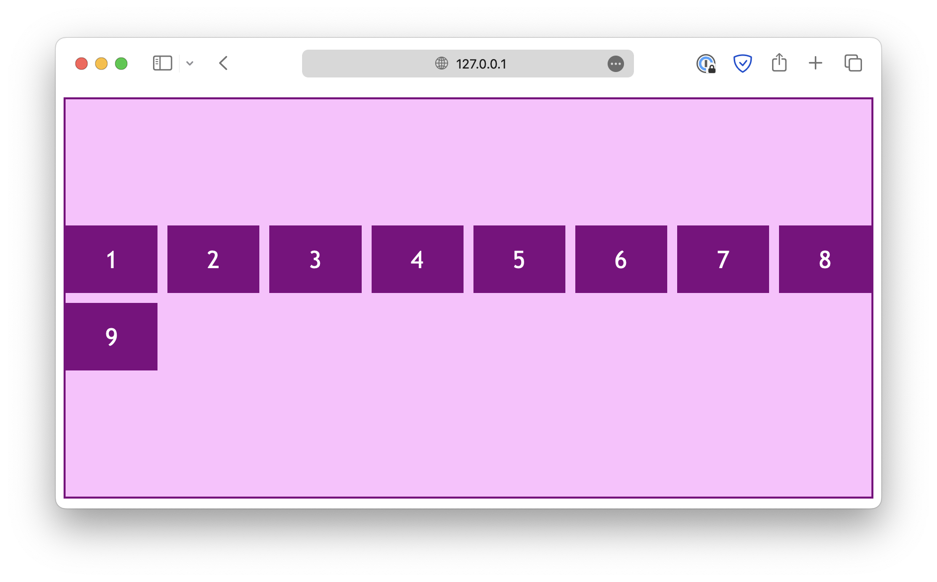
If flex-direction is set to row, the main axis is horizontal:
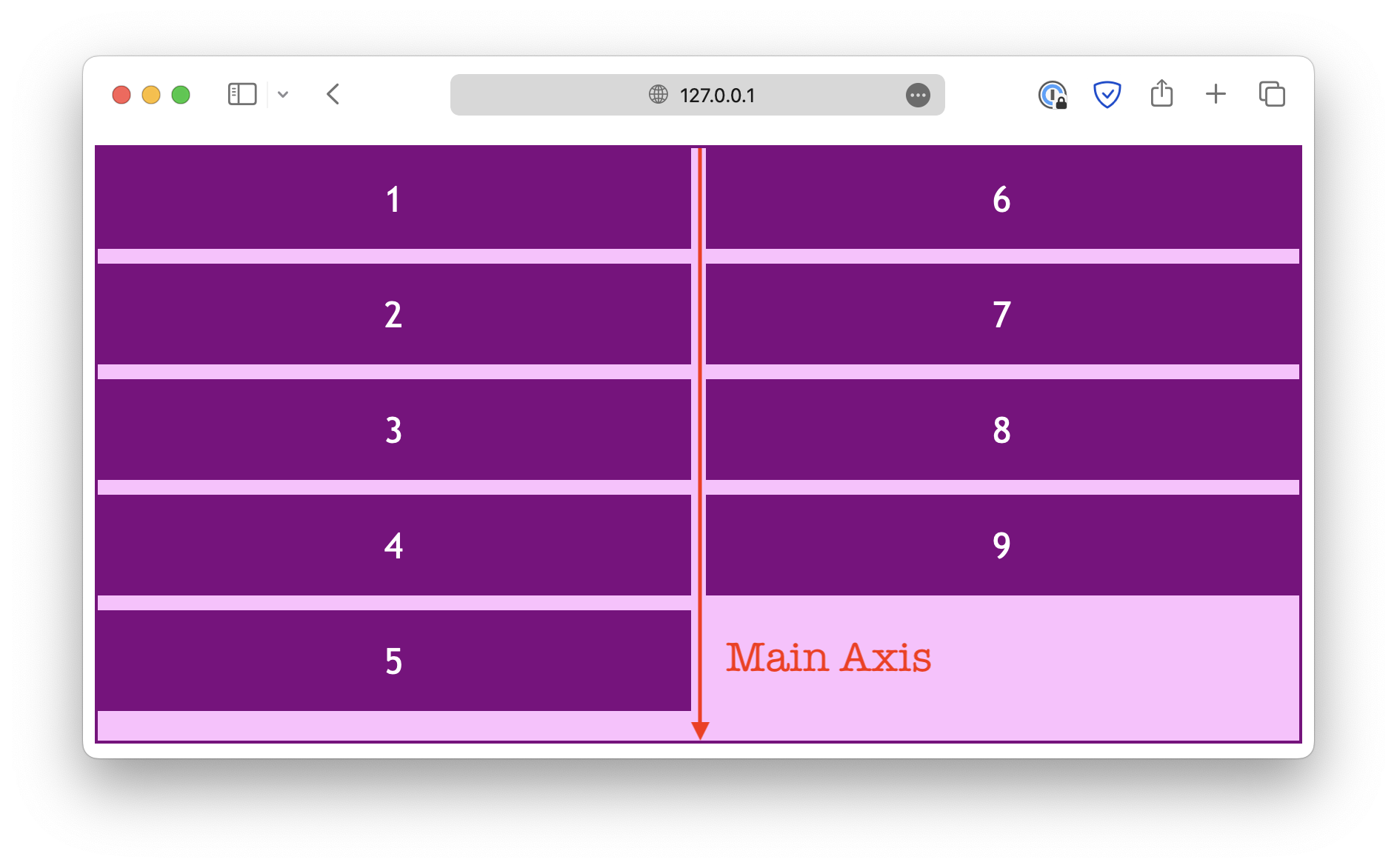
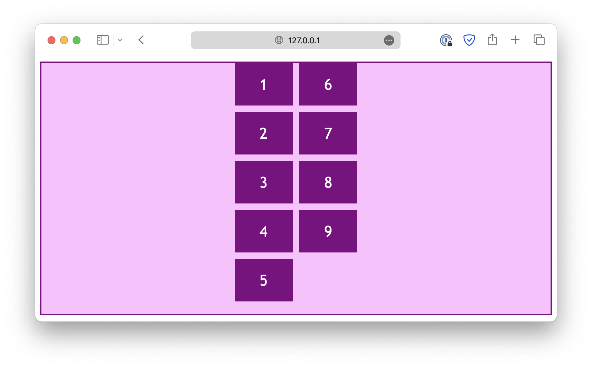
When you change the flex-direction property, the main axis also changes.
<div class="container">
  <div class="item">1</div>
  <div class="item">2</div>
  <div class="item" id="Item">3</div>
  <div class="item">4</div>
  <div class="item">5</div>
  <div class="item">6</div>
</div>.container {
display: flex;
flex-direction: row; /* Experiment with this */
flex-wrap: wrap;
gap: 10px;
height: 300px;
}Parallel to the main axis
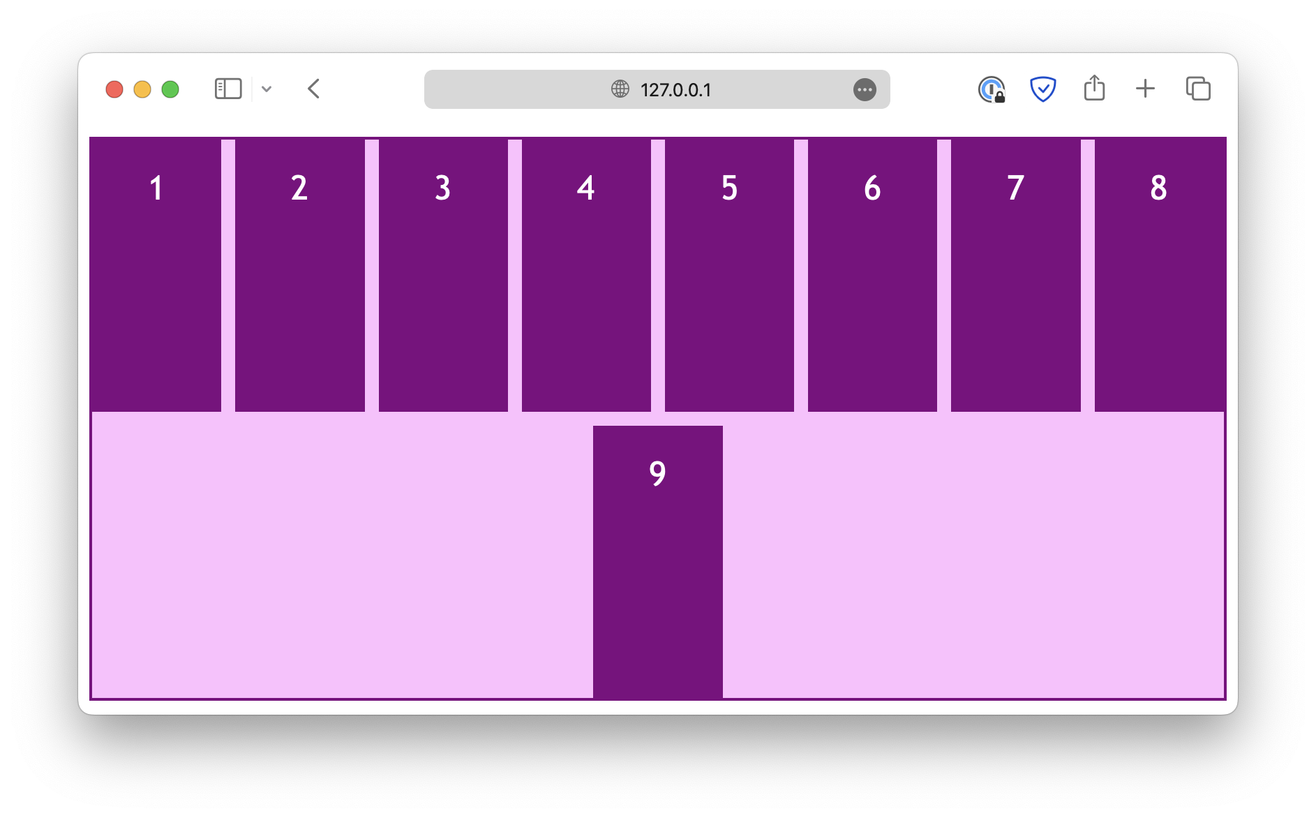
The justify properties deal with alignments in the direction parallel to the flex main axis. For example, when the flex-direction is set to row:
.container {
  display: flex;
  flex-direction: row;
  flex-wrap: wrap;

  height: 400px;

  justify-content: center;
}
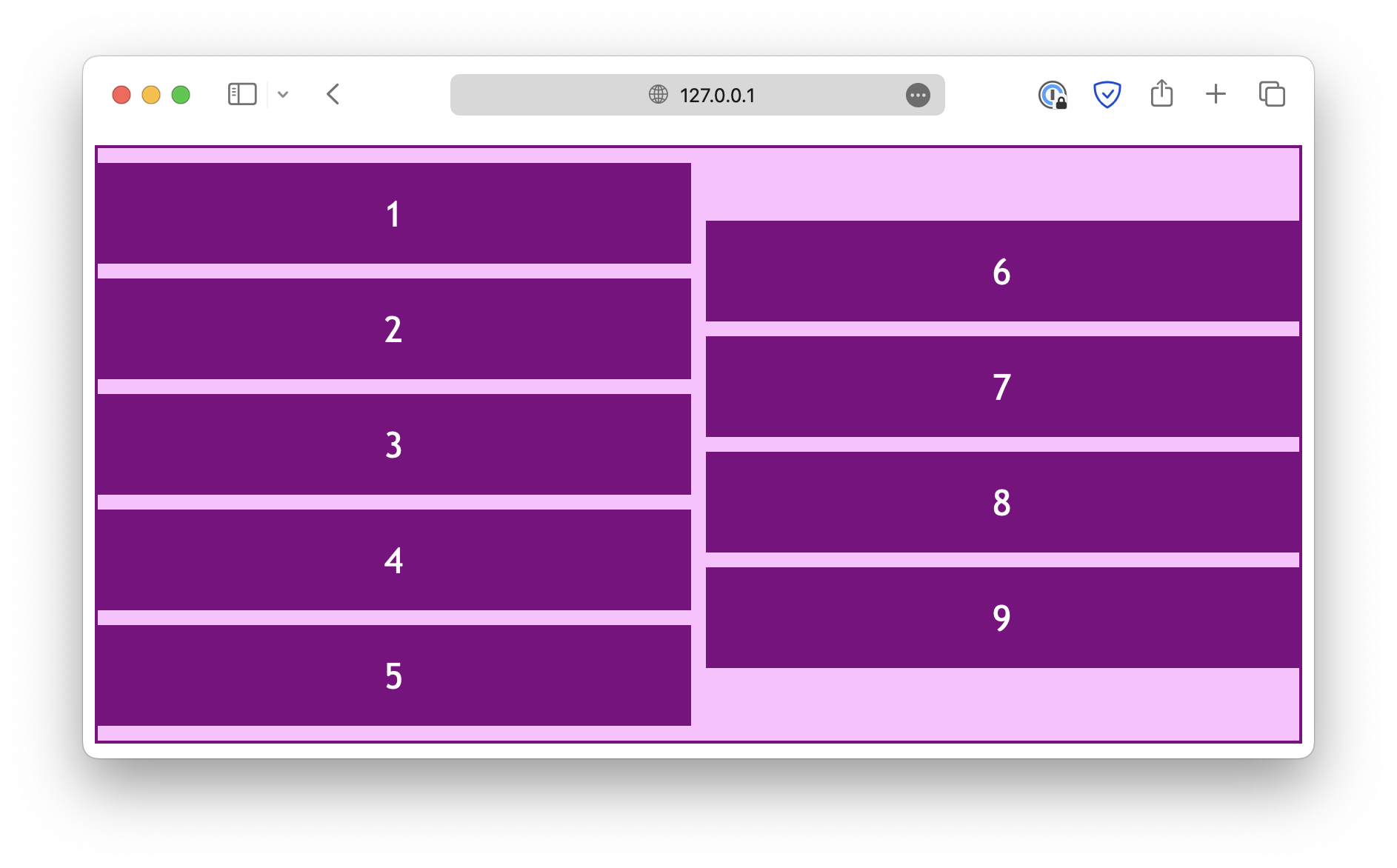
And when the flex-direction is set to column:
.container {
  display: flex;
  flex-direction: column;
  flex-wrap: wrap;

  height: 400px;

  justify-content: center;
}
Note that the justify-items and justify-self properties are useless in a flex layout.
Also, instead of keywords start and end, there are flex-start and flex-end, designed specifically for a flex layout.
In most cases, start and end would also work, but you might need to use the flex-* keywords for the best browser compatibility.
Perpendicular to the main axis
On the other hand, the align properties deal with the alignment in the direction perpendicular to the main axis.
When the flex-direction is set to row:
.container {
  display: flex;
  flex-direction: row;
  flex-wrap: wrap;

  height: 400px;

  align-content: center;
}
And when the flex-direction is set to column:
.container {
  display: flex;
  flex-direction: column;
  flex-wrap: wrap;

  height: 400px;

  align-content: center;
}
Unlike the justify properties, the align-items and align-self properties work in a flex layout.
Similar to grid layouts, the place properties can also be used to define justification and alignment at the same time.
<!DOCTYPE html>
<html lang="en">

<head>
  <meta charset="UTF-8">
  <meta name="viewport" content="width=device-width, initial-scale=1.0">
  <title>Document</title>

  <link rel="stylesheet" href="/styles.css">
</head>

<body>

  <div class="container">
    <div class="item">1</div>
    <div class="item">2</div>
    <div class="item">3</div>
    <div class="item">4</div>
    <div class="item">5</div>
    <div class="item">6</div>
  </div>

</body>

</html>